Sunday 17 March 2019

Chapter 8: Research

Two main conservation themes dominate the news currently ... plastic pollution and climate change. I had been intending to focus on the former but have come to realise that I have no desire to stitch through plastic on my sewing machine (though I feel sure it could easily manage it - I simply wouldn't enjoy the process). Nor do I relish the thought of having a wall hanging in my home which contains plastic. As a result I have opted to focus on climate change and the effects that is having on our oceans and weather systems.I live in the Pennines and we regularly feel the effects of climate change with floods in nearby towns and the increasingly frequent moorland wildfires, so this is also relevant to my local environment.

I began my research, as I usually do, by searching for quotes:


Fig: 8:1

Conservation ... according to my dictionary ... is the act of conserving, or keeping from change, loss, injury etc and also protection, preservation and careful management of natural resources.

“Climate change has happened because of human behaviour” “We are the first generation to realise that we are killing our planet and the last generation to be able to stop it.” Francois Holland’s said “We have a single mission ... to protect and hand on the planet to the next generation.” “We have to wake up to the fierce urgency of the now” “Future generations will judge us harshly if we fail to uphold our moral and historical responsibilities.” Astrid Herbert says “Climate change is no longer a doomsday prophecy, it’s a reality.” Barack Obama said that “No challenge poses a greater threat to future generations than climate change.” Even Albert Einstein commented on the problem “We shall need a substantially new way of thinking if humanity is to survive.” I particularly like this Kenyan proverb, which I now have pinned up on my kitchen noticeboard: “Treat the earth well. It was not
given to you by your parents. It is loaned to you by your children.”
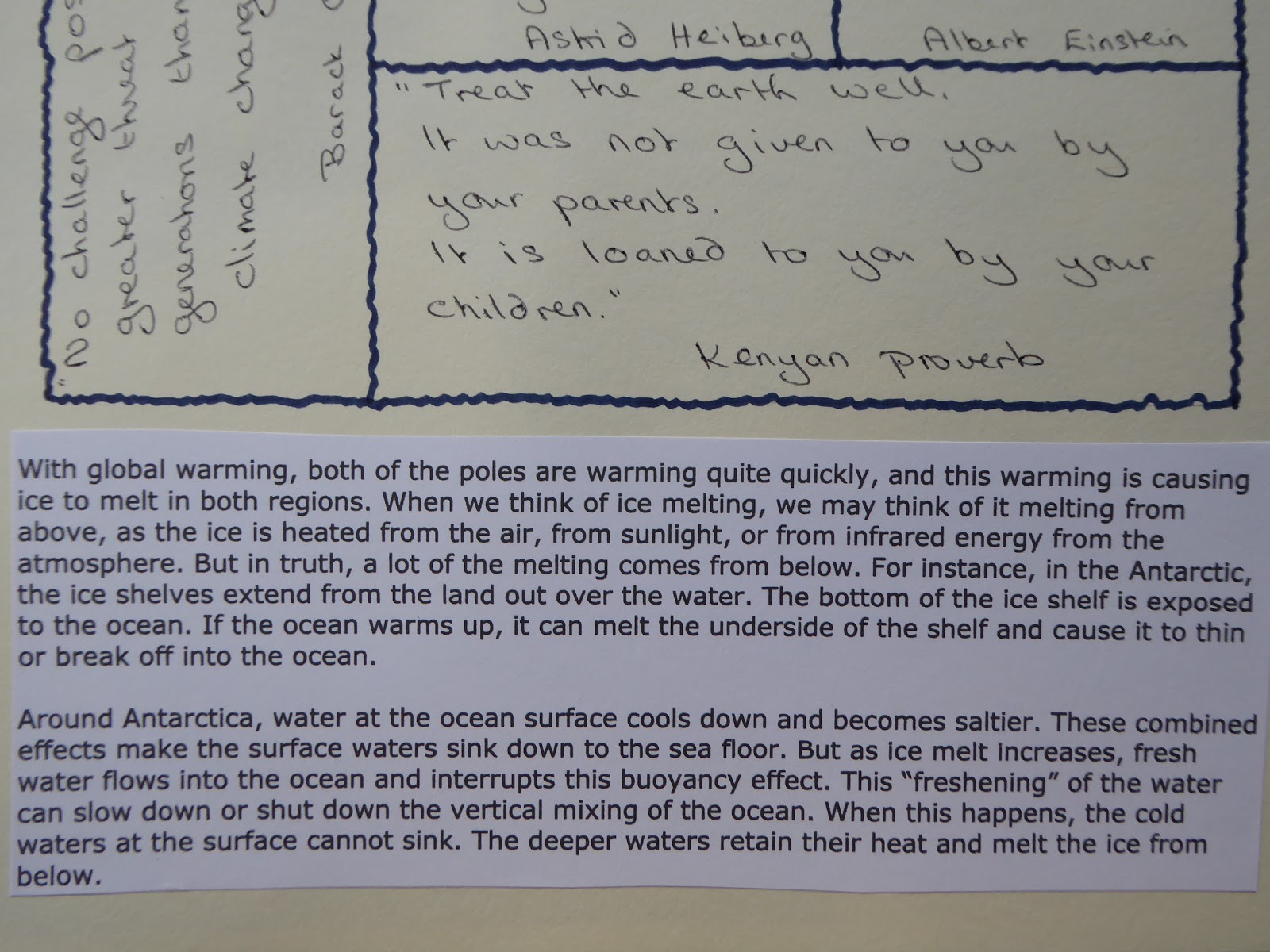
Fig: 8:2

These two paragraphs in Fig. 8.2 explain exactly what is happening to our planet.


Fig: 8:3

Fig: 8:4
Figs. 8.3, 8.4 and 8.5 show pages of research from my workbook. The focus highlighted in recent news stories is to limit global warming to 1.5 degrees Celsius rather than the 2degrees previously thought acceptable. I was interested to learn what difference this 0.5 degree would make.

10 million fewer people would lose their homes to rising seas
2 million sq km of permafrost will be saved over centuries
50% reduction in global population experiencing water scarcity
1 per century limit on sea-ice-free summers in the Arctic and
50% reduction in species losing half their geographic range

Fig: 8:5

Fig: 8:6
This is a news photograph taken during the most recent fire on Marsden moor, just a few miles away from my home town.

Fig: 8:7
And Fig. 8.7 shows the flooding in Hebden Bridge which occurs with depressing regularity.

Our next task was to think of words which relate to our theme and then to interpret them using only black and white paper.

My list was as follows: beauty of the sea; melting; cracking; powerful; turbulent; threatening; overwhelming; hunger; terror; stressed; vulnerable; violent; panic as flames spread or ice melts; worry about the future; shattered; confusion.
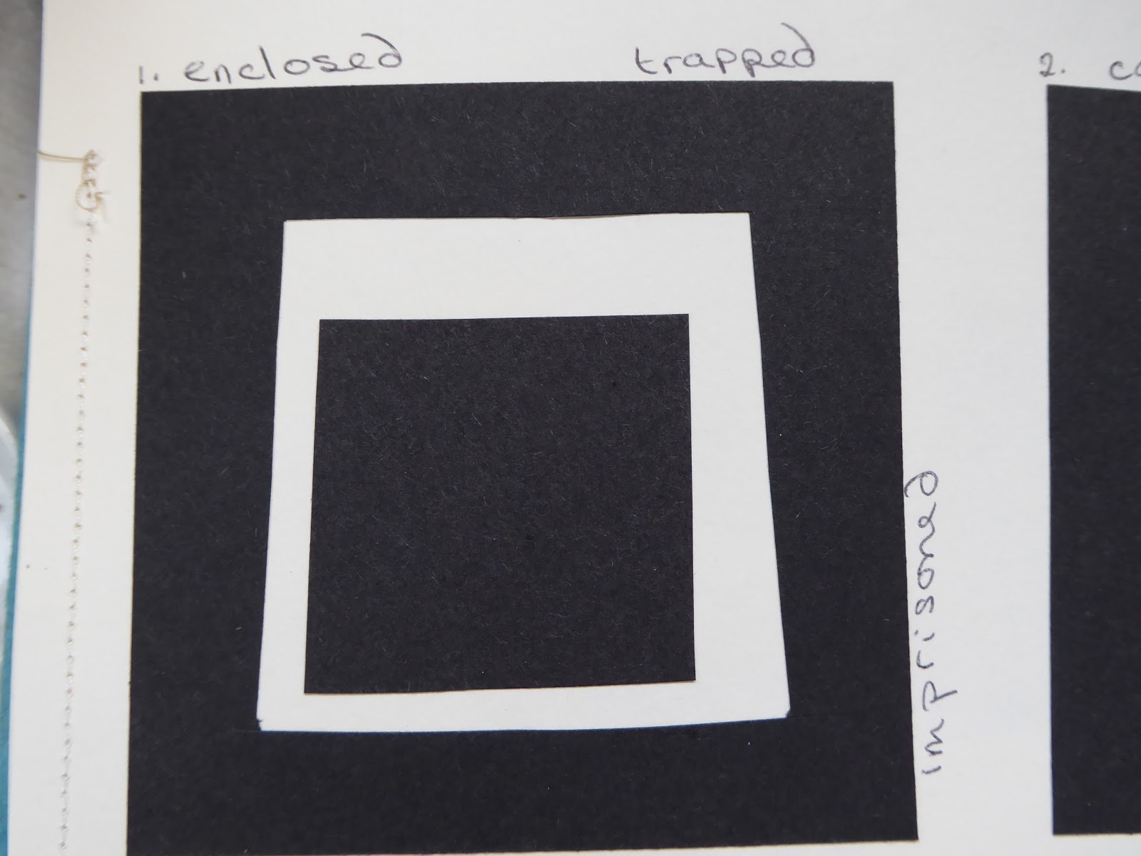
Fig: 8:8 
Enclosed; trapped; imprisoned
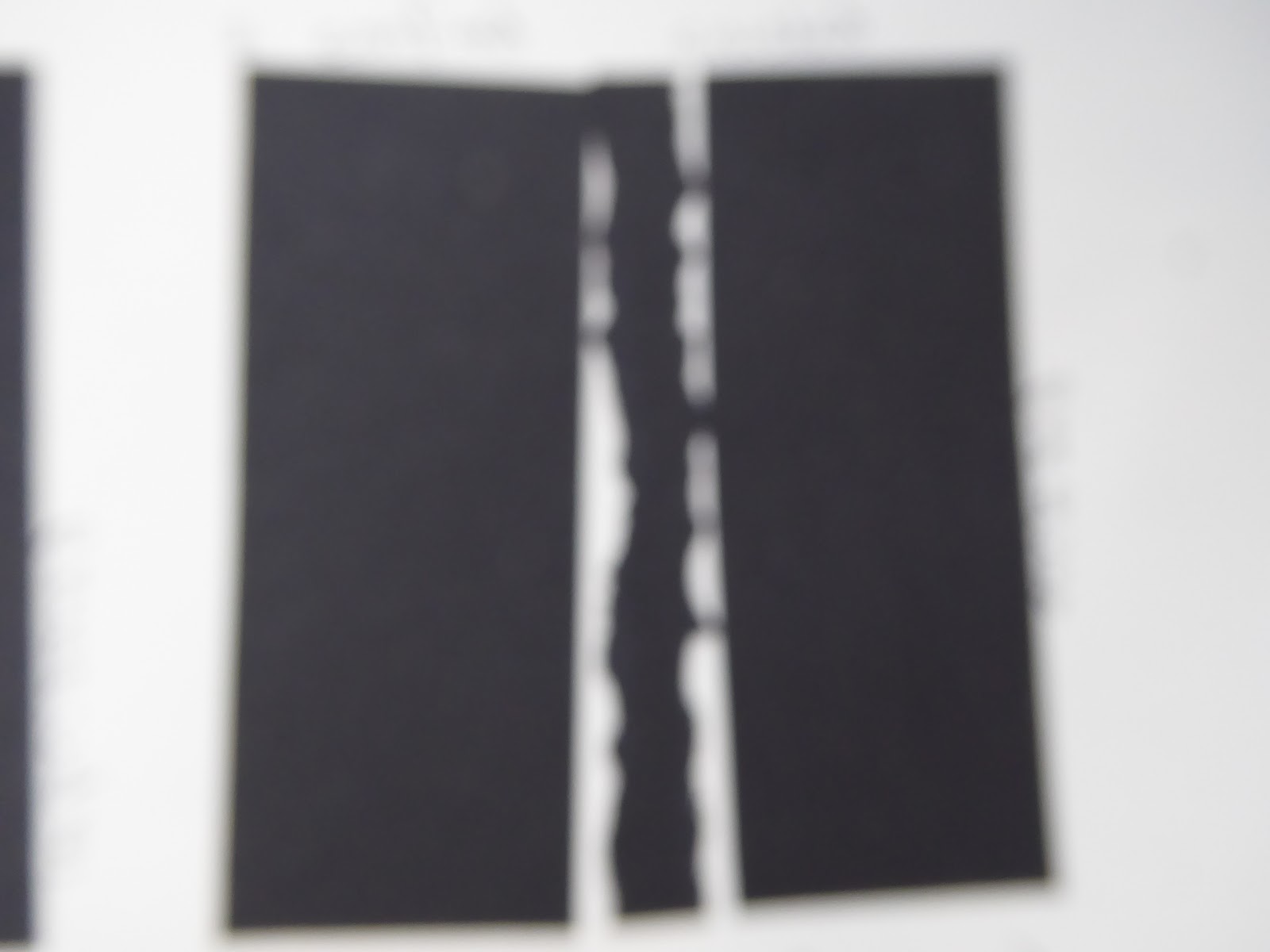
Fig: 8:9 
confined; crushed; enclosed

Fig: 8:10 
Crushed; compressed

Fig: 8:11 
Cracked; fractured

Fig: 8:12
Entwined; mingling; rhythmical; gentle

Fig: 8:13 
Frenzied; vigorous

Fig: 8:14 
Crushed; compressed; pressure; stressed

Fig: 8:15 
Melting; peaceful

Fig: 8:16
Crushed; expelled; violent; vulnerable

Fig: 8:17 
Fractured; cracked; shattered; violent

Fig: 8:18 
Gentle; calm; peaceful; quiet

Fig: 8:19
Confused; frenzied; cracking; violent

I then chose seven of these black and white images to enlarge slightly using coloured papers. I have used papers previously coloured for this and a previous module but they are mainly in my chosen colour palette of blues, white and oranges.
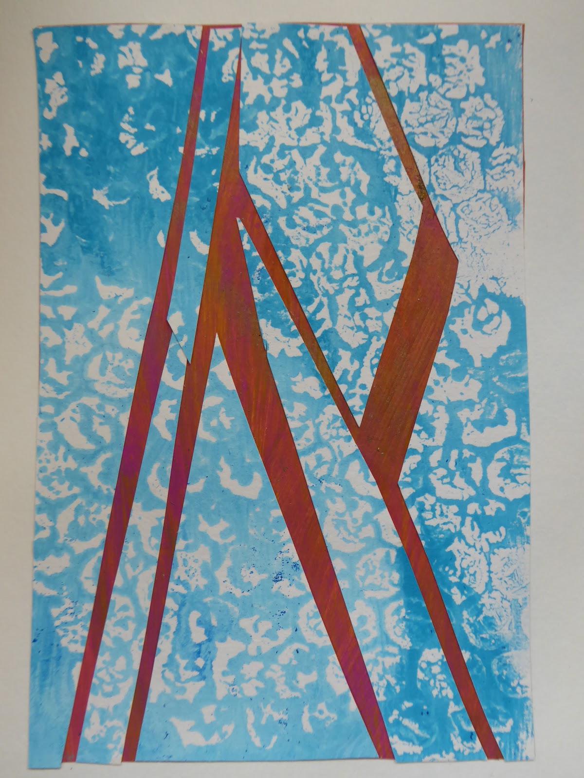
Fig: 8:20 
I like this sample very much and feel it could easily be developed into a final design to represent the cracking ice, turbulent seas/flood water and also the flames of the wildfires. It is definitely one that I will take forward into the next chapter

Fig: 8:21
This could represent the shifting ice floes as the ice melts and cracks, pushing sections out into the open seas.

Fig: 8:22
A more gentle design which could represent the ripples on the water or even fish swimming beneath the ice.

Fig: 8:23
More frenzied, cracking and disintegrating icebergs against a background of flames or simply the hot colours representing global warming in general.

Fig: 8:24
The 'orange' painted paper in this sample lends a smoky effect to the design which originally represented the feeling of being trapped so perhaps this is appropriate!

Fig:8:25
A development on representing conflict and confusion from Sian's examples in the module notes which seems appropriate to my theme, thinking of the wildlife caught in the fires and also on the disappearing ice masses in the Arctic and Antarctic.

Fig: 8:26
And finally a sample reflecting compression, thinking perhaps of how the ice caps melt from below and fall in on themselves.


Chapter 7: Dissolving fabric

I began this chapter by collecting a selection of dissolvable fabrics bought from Art Van Go, Colourcraft and Barnyarns at the Knitting and Stitching show in November last year. The samples don't show up on a photograph as, of course, they are all transparent, but here are my thoughts on the various materials.

a: Aquabond is a sticky soluble frilm. The front of the film is coated in a soluble glue and it is used to stick to 'tricky' fabrics e.g. knitted or delicate fabrics or velvet which might be prone to damage if using a hoop.
b: Romeo heavyweight is stable enough to use without a hoop. It is possible to draw a design onto the fabric with a water soluble pen or to put it through an inkjet printer when attached to a carrier sheet using low-tack adhesive.
c: Lightweight soluble film needs to be used in a hoop or used in more than one layer for greater stability. Again it is possible to draw or trace a design onto the film with a water soluble pen. It can be used underneath, on top of, or to sandwich embroidery or loose threads.
d: Solufleece is like a fine Vilene and needs to be used in a hoop or in multiple layers for greater stability.

Our next task was to work technical samples using each of the fabrics. I didn't work a technical sample on the Aquabond as this appears to have a particular use and would be used in connection with one of the other films.

Fig: 7:1


The top sample in the above image is worked on heavyweight Romeo, which I found was easy to stitch without a hoop, though I wasn't fond of the plastic feel. It also took quite a while to wash out. It does, however, make for a very stable sample.

The next sample is worked on Lightweight soluble film, which was stronger than I had expected when putting it into the hoop but it did tear under the needle whilst stitching. More like fabric than the Romeo and very easily rinsed away.

The third sample (4a in the image) is worked on Solufleece. I first tried this without a hoop as it felt like fabric but it puckered and gathered under the needle, giving a very shrunken finished piece.

The final sample (4b) is also worked on Solufleece, but this time in a hoop, which worked much better. It stitches like fabric and is very easy to rinse away afterwards.

We were then asked to work different stitches using just one type of fabric. I used Sian's key for the stitch methods:
1. Normal stitching; 2. Free machine stitch; 3. Open effect; 4. Dense effect; 5. In one direction; 6. In opposite directions; 7. In curved shapes; 8. Straight stitch; 9. Zig-zag stitch; 10. Cable stitch and 11. With trapped threads.
Fig: 7:2
Sample 1A in Fig. 7:2 uses 1, 6 and 9 - some threads were worked in a straight stitch, others in zig-zag, which made for a very stable sample.
2A uses 2, 8, 6 and 3
3A uses 2, 9, 6 and 3
4A uses 2, 4, 6 and 8
5A uses 2, 7, 8 and 3
6A uses 2, 6, 8 and 10
Fig: 7:3 
Sample 7A uses 2, 8, 10 and 11 ... and
Sample 8A uses 2, 7, 8 and 11

The next task was to produce a series of larger samples based on the drawings done in Chapter 1.

Fig: 7:4
When I began this section I realised that I had not yet worked a very solid piece of stitching so this sample is worked in crossing lines of straight stitch. I added the extra colours by way of contrast and thus it is really only loosely based on the original sample of acrylic paint sponged onto acetate. It is, however, an effective rendition of reflections on the sea's surface - especially echoing Van Gogh's painting (though it did use up a great deal of thread).
 
Fig: 7:5
I was unsure which way to mount this sample of spiralling straight stitch as I liked both sides equally. In the end I opted to put the reverse uppermost. I used a deep turquoise thread in the needle and yellow in the spool, and I think the reverse better echoes the frottage sample from Chapter 1, and again references the sunlight glinting on the water's surface.

Fig: 7:6

Sample 7:6 is worked with a spiralling straight stitch in a pale blue with meandering lines in dark blue which echo the ink marks in the painted sample. I really like the lacy effects achieved with this spiralling stitch and in different colours this could easily relate to jet trails in the sky. Using a cable stitch would further enhance that effect.

Fig: 7:7
 Sample 7:7 is worked with spiralling zigzag stitch connecting snippets of crystal organza in a paler blue and accurately echoes the bubble wrap prints from Chapter 1. Again, they look a little like the ripples on the surface of the water in some of my original photographs taken from the ferry on the way to Bute.

Fig: 7:8
 Sample 7:8 is meandering lines of zigzag stitch in a dark blue thread connecting fish-like shapes of hand dyed cotton fabric. More meandering lines, this time in straight stitch in a pale turquoise thread form a web (or net) of stitches to further hold the piece together. The inspiration for this came from the sample in Chapter 1 where acrylic paint was sponged over the edge of a torn piece of card onto acetate.

Fig: 7:9


The final sample is very much a case of waste-not, want not as this is the piece of fabric which the pieces for sample 7:8 were taken from. A much more solid piece which refers back to the oil pastel trapped between two piece of plastic and ironed in Chapter 1. As the fabric was going to hold this firm I just worked meandering lines across the piece to form lacy webs within the spaces.


An addition to Chapter 6

I did a further couple of samples for this chapter, as requested ...

Sample 5: Hand dyed cotton was stitched with zigzag stitch circles to mimic the wax pastel circular marks on the paper version. Pieces of red, blue and white chiffon were stitched in white, grey and yellow then the edges frayed. The original photograph for this was actually a sunset but now it looks more like reflections on water which is perhaps more in line with my proposed finished piece of work.


Sample 6: I loosened the top tension and stitched the circles on the base fabric from behind this time before adding the chiffon strips. The third layer was scrim (hand dyed) already stitched with circles and sadly I think I got a little confused when cutting areas away so the curves of the strips have been lost somewhat in some areas though I know how to remedy this should I need to replicate it in the future. Again very reminiscent of reflections on water!