
Friday 5 July 2019
Monday 1 July 2019
Three artists
Jae Maries
Jae Maries trained as a painter, doing a degree in Fine Art at Reading University before enrolling on a Post Graduate Diploma at Bright Polytechnic. She uses a sketchbook to record daily life using abstracted marks, which she later translates into larger artworks. Using simple shapes and colours, she makes her designs first in paper collage, then uses applique and hand and machine embroidery to interpret her theme. Her work, however, is unplanned and evolves through the various processes which she employs.
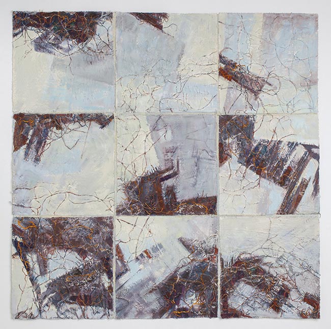
 Her work 'Turbulent Seas' particularly relates to this module as it tells the story of an English fishing port, describing the decline of the fishing industry.
(62group.org.uk)
Barbara Lee Smith
Barbara Lee Smith is an American mixed media artist who creates large scale works of impressionistic landscapes and abstracts, always based closely on the environment, and celebrating nature. Born in New Jersey in 1938, she studied home economics at University, then married and moved to New York. Only at the age of 40 did she complete a Masters degree in Fine Art and begin to think of herself as a professional artist.


She was particularly impressed by the work of Jackson Pollock and Kandinsky and returned to college in the 1970's to study mixed media. Since graduating she has worked as a studio artist, first spraying dyes onto cotton or silk fabrics, then adding texture with multiple layers of fabric and machine stitch - always stitching from the back of the work so she can use rayon thread in the bobbin.
She describes her work as a three stage process of painting, collage and drawing.
Her relevance to this module results from Barbara's belief that creation arises from destruction and sees this in the environment as well as her work - 'the tide hauling detritus out to sea, transforming it and sending it back to the land'. She sees beauty in the midst of the mess, which is what we are attempting to achieve in this module, making an attractive piece of work which represents the devastation of environmental pollution.
(www.barbaraleesmith.com and textileartist.org)
Sandra Meech
Originally from Canada and now living in Somerset, Sandra Meech is a quilt artist who uses photo imagery, drawing and collage as a starting point for her work. Sandra trained as a fine artist and illustrator and was working as a graphic designer and art director in magazine publishing when she moved to London. A member of a number of textile groups including Studio 21, South West Textile Group and the international Quilt Art, she now exhibits widely and teaches in addition to having produced a whole series of books on creativity and design as well as art quilting.
 'Near North'
 'What Were You Thinking?'
Inspired by nature, her works entitled 'Near North', which highlights the threats faced by woodland of climate change and urban sprawl, and 'Meltdown' in particular resonate with this module. Meltdown is a series of textile pieces highlighting the melting ice in Arctic Canada, the final piece in the series being entitled 'What Were You Thinking?' shows Mother Nature looking down at the melting ice.
(www.arttextilesmadeinbritain.co.uk; www.sandrameech.com; studio21textileart.co.uk)
Jae Maries trained as a painter, doing a degree in Fine Art at Reading University before enrolling on a Post Graduate Diploma at Bright Polytechnic. She uses a sketchbook to record daily life using abstracted marks, which she later translates into larger artworks. Using simple shapes and colours, she makes her designs first in paper collage, then uses applique and hand and machine embroidery to interpret her theme. Her work, however, is unplanned and evolves through the various processes which she employs.
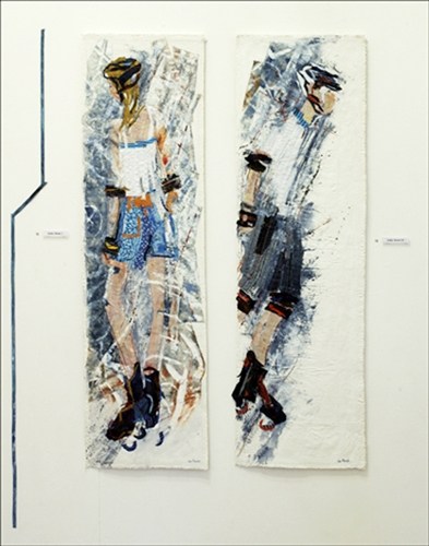
Deep Freeze
Roller Bladers
Jae is a member of the 62 Group of Textile Artists and draws inspiration for her work from figures in the environment and from her travels around the world. She has commissioned pieces hanging in a number of public places, is a freelance lecturer and tutor, exhibits internationally and has written a book entitled 'Contrasting Elements'
(62group.org.uk)
Barbara Lee Smith
Barbara Lee Smith is an American mixed media artist who creates large scale works of impressionistic landscapes and abstracts, always based closely on the environment, and celebrating nature. Born in New Jersey in 1938, she studied home economics at University, then married and moved to New York. Only at the age of 40 did she complete a Masters degree in Fine Art and begin to think of herself as a professional artist.
She was particularly impressed by the work of Jackson Pollock and Kandinsky and returned to college in the 1970's to study mixed media. Since graduating she has worked as a studio artist, first spraying dyes onto cotton or silk fabrics, then adding texture with multiple layers of fabric and machine stitch - always stitching from the back of the work so she can use rayon thread in the bobbin.
She describes her work as a three stage process of painting, collage and drawing.
Her relevance to this module results from Barbara's belief that creation arises from destruction and sees this in the environment as well as her work - 'the tide hauling detritus out to sea, transforming it and sending it back to the land'. She sees beauty in the midst of the mess, which is what we are attempting to achieve in this module, making an attractive piece of work which represents the devastation of environmental pollution.
(www.barbaraleesmith.com and textileartist.org)
Sandra Meech
Originally from Canada and now living in Somerset, Sandra Meech is a quilt artist who uses photo imagery, drawing and collage as a starting point for her work. Sandra trained as a fine artist and illustrator and was working as a graphic designer and art director in magazine publishing when she moved to London. A member of a number of textile groups including Studio 21, South West Textile Group and the international Quilt Art, she now exhibits widely and teaches in addition to having produced a whole series of books on creativity and design as well as art quilting.
 'Near North'
'Meltdown'
 'What Were You Thinking?'
(www.arttextilesmadeinbritain.co.uk; www.sandrameech.com; studio21textileart.co.uk)
Final wallhanging
My final piece for this course (Fig. 1 & 2) was certainly both a challenge and, being large, abstract and machine embroidered, so far outside my comfort zone, that I have found it difficult to judge its worth. It meets the brief in that it is a little larger than A1 size and is based on the topic of conservation.
Inspired by the twin threats to the Yorkshire region where I live of moorland fires and regular flooding I believe that the work represents these phenomena effectively. My personal preferred stitching method is needlelace and I wanted this piece to also be lacy as it was important to me that it had at least some bearing or link to my 'normal' style. I achieved this by making each piece of machine embroidery from scrim, which was slashed before stitching and then backed with a different colour of scrim to represent the movement in both the flames and the flood water (Fig. 6 is an example of the method used). The whole wallhanging is mounted on a pale grey net tulle which adds to the lacy effect.


Some strips of stitching were made wider and longer than their allotted space, which allowed me to use the furrowing technique learned in the previous module, to attach them to the backing (Fig. 3 & 4 are examples). The black square (Fig. 8) represents the homes which are under threat and the fear and continuing anxiety of their occupants. To add to this imagery I backed the black scrim with red, used a spiralling stitch to represent the smoke damage and added a border of machine stitched lace to reference the doileys that may be in the homes.
This same spiralling stitching is echoed on some of the strips (Fig. 7) to represent the smoke in the air, which often means that people in the vicinity must keep windows and doors closed to avoid smoke inhalation.
I made three A3 size design boards which are hinged together with the board shown in Fig. 10 in the centre.
The wallhanging has taken a long time to make, partly because I unpicked it from the net backing at least twice because I was unhappy with the way it looked. I stitched a channel in the top edge of the net backing, which allows it to hang from an expanding curtain rail at my cloakroom window. On the whole I am happy with how the piece has turned out and I do like the way the light shining through it from the window, again adds to the ethereal and lacy effect.
If I were to make it again I would certainly trust my own instincts more and not be swayed by friends' comments or 'advice' (and would then probably have to do a lot less unpicking!). I might also try backing it with a different fabric - maybe an organza - as I had intended to machine stitch the backing but the net stretched and gathered, making this impossible.
The course as a whole:
A textile related qualification has been a long held dream but career and family commitments have always prevented me from going down that path. I woke up on new year's morning four years ago and decided that if I didn't follow that dream now then I never would. The course has taken longer than I initially intended but then again when I began I had no idea that in addition to that qualification I would also have two beautiful grandsons by the time I had finished.
Two main things influenced my choice of course:
1. It could be done entirely by distance learning. I don't drive and travel to some of the alternatives on offer at the time would at best have been difficult by public transport.
2. Having read the course description and looked through the student galleries online I knew the course would challenge me and take me out of my comfort zone... important to keep the little grey cells firing on all cylinders!!
This has certainly been the case and I have learned a great deal in the process, I have learned:-
Costing
Sketchbook: £4.99
Fabric: most was taken from stock bought for earlier modules - estimate approximately £5.
Soluble fabric for the whole module: £12.50 though there is lots left for future use.
Dyes for scrim for final wallhanging: £3
Storage of materials and health and safety:
See earlier modules for details of this. Specific areas of health and safety for this module are as follows:
Dyeing fabrics
Take care when mixing dyes, wearing a dust mask and gloves in a well ventilated area to avoid inhalation. Keep powders and any mixed dyes and solutions stored securely, clearly labelled and away from children and pets.
Machine stitching
Your chair should have a firm backrest and allow your feet to rest flat on the floor and at a height that is comfortable and your machine should sit on a firm table and be in good natural light. Keep fingers well away from the needle whilst stitching - an embroidery hoop facilitates this.
Inspired by the twin threats to the Yorkshire region where I live of moorland fires and regular flooding I believe that the work represents these phenomena effectively. My personal preferred stitching method is needlelace and I wanted this piece to also be lacy as it was important to me that it had at least some bearing or link to my 'normal' style. I achieved this by making each piece of machine embroidery from scrim, which was slashed before stitching and then backed with a different colour of scrim to represent the movement in both the flames and the flood water (Fig. 6 is an example of the method used). The whole wallhanging is mounted on a pale grey net tulle which adds to the lacy effect.

Fig. 1

Fig. 2

Fig. 3

Fig. 4

Fig. 5

Fig. 6

Fig. 7

Fig. 8

Fig. 9 - Fire

Fig. 10 - Original design

Fig. 11 - Flood
Some strips of stitching were made wider and longer than their allotted space, which allowed me to use the furrowing technique learned in the previous module, to attach them to the backing (Fig. 3 & 4 are examples). The black square (Fig. 8) represents the homes which are under threat and the fear and continuing anxiety of their occupants. To add to this imagery I backed the black scrim with red, used a spiralling stitch to represent the smoke damage and added a border of machine stitched lace to reference the doileys that may be in the homes.
This same spiralling stitching is echoed on some of the strips (Fig. 7) to represent the smoke in the air, which often means that people in the vicinity must keep windows and doors closed to avoid smoke inhalation.
I made three A3 size design boards which are hinged together with the board shown in Fig. 10 in the centre.
The wallhanging has taken a long time to make, partly because I unpicked it from the net backing at least twice because I was unhappy with the way it looked. I stitched a channel in the top edge of the net backing, which allows it to hang from an expanding curtain rail at my cloakroom window. On the whole I am happy with how the piece has turned out and I do like the way the light shining through it from the window, again adds to the ethereal and lacy effect.
If I were to make it again I would certainly trust my own instincts more and not be swayed by friends' comments or 'advice' (and would then probably have to do a lot less unpicking!). I might also try backing it with a different fabric - maybe an organza - as I had intended to machine stitch the backing but the net stretched and gathered, making this impossible.
The course as a whole:
A textile related qualification has been a long held dream but career and family commitments have always prevented me from going down that path. I woke up on new year's morning four years ago and decided that if I didn't follow that dream now then I never would. The course has taken longer than I initially intended but then again when I began I had no idea that in addition to that qualification I would also have two beautiful grandsons by the time I had finished.
Two main things influenced my choice of course:
1. It could be done entirely by distance learning. I don't drive and travel to some of the alternatives on offer at the time would at best have been difficult by public transport.
2. Having read the course description and looked through the student galleries online I knew the course would challenge me and take me out of my comfort zone... important to keep the little grey cells firing on all cylinders!!
This has certainly been the case and I have learned a great deal in the process, I have learned:-
- to make better use of a workbook;
- new ways of designing a piece of work;
- to design first in paper - cheaper than experimenting immediately with sometimes expensive fabric and thread;
- it is not necessary to stick slavishly to that paper design;
- to work in a more free way;
- to enjoy machine embroidery (a major revelation);
- to work in a more abstract way
Costing
Sketchbook: £4.99
Fabric: most was taken from stock bought for earlier modules - estimate approximately £5.
Soluble fabric for the whole module: £12.50 though there is lots left for future use.
Dyes for scrim for final wallhanging: £3
Storage of materials and health and safety:
See earlier modules for details of this. Specific areas of health and safety for this module are as follows:
Dyeing fabrics
Take care when mixing dyes, wearing a dust mask and gloves in a well ventilated area to avoid inhalation. Keep powders and any mixed dyes and solutions stored securely, clearly labelled and away from children and pets.
Machine stitching
Your chair should have a firm backrest and allow your feet to rest flat on the floor and at a height that is comfortable and your machine should sit on a firm table and be in good natural light. Keep fingers well away from the needle whilst stitching - an embroidery hoop facilitates this.
Monday 6 May 2019
Chapter 10B: Wallhanging samples
The next task in producing my wallhanging was to enlarge the A3 design to the final size of A1. Not as easy as I thought!! I confidently took my design into town to the print shop ... only to find that the print shop had disappeared!! None of the shops or the library were able to photocopy anything larger than A3. So ... I had two photocopies made - 1 x A3 and 1 reduced to A4 for my presentation board. Back home I took my A3 copy and cut it into 8 pieces. I then enlarged each of these on my own printer to A4 size and taped them all together. The resulting design is almost, though not quite A1 size but near enough for me to work out sizes for each piece of embroidery. The only problem now being that all that photocopying and enlarging has muted the colours considerably but I will refer back to my original papers for my stitching.
Moving on ...
We were then tasked with producing three samples for each paper used in the design. However, due to the large number of papers I used (10 in all) I quickly realised that once translated into embroidery this could end up looking very 'bitty' and took the decision to limit myself to just four types of embroidered pieces.

This photograph shows two methods for stitching the 'fire' sections of my wallhanging. The fabric I used is the lining of an old umbrella which was printed with Turner's 'Fighting Temeraire'. In the left hand piece I simply stitched across the flame shaped negative spaces. The fabric has formed a rather interesting texture in the process.
The little flame shaped piece on the right is formed by sandwiching three of the flames cut from the first piece between a sticky water soluble fabric and a piece of Romeo soluble film. I purposely didn't rinse all the film out so the threads are still a little firm and the fabric has again buckled. I really like this sample and would like to use this towards the centre of the wallhanging. My only concern is whether it would be considered too figurative?

My third 'fire' sample is worked on scrim with flame shapes stitched on top in a shiny yellow viscose thread. I'm aware that this doesn't show up too well in the photograph but in reality is quite effective. Because it has not been attached to any soluble fabric it has produced a lovely soft fabric which would be very easy to manipulate and stitched onto different colours of scrim (see images below) would, I believe, satisfy the need for different shaded areas without using totally different embroidery methods.

I stitched this solid piece of machine embroidery on a piece of soluble fabric to mimic the very bottom 'flood' strip in my design, which I think it does adequately, however the remainder of the wallhanging really needs to be more 'ethereal' and flexible so I would not choose to use this.

Because I liked the 'fire' sample stitched on scrim I returned to this for my next sample (10B:4). Having stitched over the scrim to open up the weave I then stitched waving lines in white thread across the entire piece. I like this but decided it as maybe a little too subtle.

... so I returned to the pure machine embroidery on soluble fabric and then stitched the wavy lines in cable stitch using a thick cotton thread. This is a definite possibility!!

Sample 10B:6 is stitched on totally the wrong colour of scrim to reflect the flood waters in my inspiration photograph but I only have a small piece of grey/pale blue scrim left (again, see images below) so decided to save that for the final wallhanging if necessary. I decided to try to get some texture into the 'flood' side of the piece so crumpled a piece of scrim onto the adhesive soluble fabric, covered it with a piece of non-adhesive soluble and stitched circles in a grey thread. Another possible winner which would mimic the movement of the flood water.


I decided to try for more movement by first stitching a piece of just embroidered circles (Figl 10B:7), and then a piece of scrim with holes cut into it (Fig. 10B:8). I used a dark grey thread on this second piece to better mimic the flood waters though would probably use the grey scrim for the final piece.
I had been thinking about how to join all these pieces together and decided that merely joining them with insertion stitches would make it tricky to get them to hang properly so went out and bought a piece of grey net. I crumpled and stitched these last two samples onto a piece of the net fabric to see how that would work. It does indeed work and the net blends into the background so from a distance the pieces of embroidery should look as though they are floating in air.
I have decided to use scrim as a background for all my embroidered pieces to make a co-ordinated whole... samples 2, 4 (with the cable stitch wavy lines rather than machine cotton) and 6. The black square in the centre of the design will also be solidly stitched onto a piece of scrim. The only exception to this 'rule' would be the addition of a small number of the flame shaped pieces added on top of some of the 'fire' areas of the design if this were not deemed to be too figurative. (I await advice on this point).
As a result of this decision with regard to fabric I have gathered together a selection of scrim pieces in relevant colours hand dyed for various pieces of work during this course and for earlier projects. I would certainly not envisage using every piece but there are certainly areas of many which could appropriately be used.


Moving on ...
We were then tasked with producing three samples for each paper used in the design. However, due to the large number of papers I used (10 in all) I quickly realised that once translated into embroidery this could end up looking very 'bitty' and took the decision to limit myself to just four types of embroidered pieces.

Fig. 10B:1
This photograph shows two methods for stitching the 'fire' sections of my wallhanging. The fabric I used is the lining of an old umbrella which was printed with Turner's 'Fighting Temeraire'. In the left hand piece I simply stitched across the flame shaped negative spaces. The fabric has formed a rather interesting texture in the process.
The little flame shaped piece on the right is formed by sandwiching three of the flames cut from the first piece between a sticky water soluble fabric and a piece of Romeo soluble film. I purposely didn't rinse all the film out so the threads are still a little firm and the fabric has again buckled. I really like this sample and would like to use this towards the centre of the wallhanging. My only concern is whether it would be considered too figurative?

Fig. 10B:2
My third 'fire' sample is worked on scrim with flame shapes stitched on top in a shiny yellow viscose thread. I'm aware that this doesn't show up too well in the photograph but in reality is quite effective. Because it has not been attached to any soluble fabric it has produced a lovely soft fabric which would be very easy to manipulate and stitched onto different colours of scrim (see images below) would, I believe, satisfy the need for different shaded areas without using totally different embroidery methods.
Fig. 10B:3
I stitched this solid piece of machine embroidery on a piece of soluble fabric to mimic the very bottom 'flood' strip in my design, which I think it does adequately, however the remainder of the wallhanging really needs to be more 'ethereal' and flexible so I would not choose to use this.

Fig. 10B:4
Because I liked the 'fire' sample stitched on scrim I returned to this for my next sample (10B:4). Having stitched over the scrim to open up the weave I then stitched waving lines in white thread across the entire piece. I like this but decided it as maybe a little too subtle.

Fig. 10B:5
... so I returned to the pure machine embroidery on soluble fabric and then stitched the wavy lines in cable stitch using a thick cotton thread. This is a definite possibility!!

Fig. 10B:6
Sample 10B:6 is stitched on totally the wrong colour of scrim to reflect the flood waters in my inspiration photograph but I only have a small piece of grey/pale blue scrim left (again, see images below) so decided to save that for the final wallhanging if necessary. I decided to try to get some texture into the 'flood' side of the piece so crumpled a piece of scrim onto the adhesive soluble fabric, covered it with a piece of non-adhesive soluble and stitched circles in a grey thread. Another possible winner which would mimic the movement of the flood water.

Fig. 10B:7

Fig. 10B:8

Fig. 10B:9
I decided to try for more movement by first stitching a piece of just embroidered circles (Figl 10B:7), and then a piece of scrim with holes cut into it (Fig. 10B:8). I used a dark grey thread on this second piece to better mimic the flood waters though would probably use the grey scrim for the final piece.
I had been thinking about how to join all these pieces together and decided that merely joining them with insertion stitches would make it tricky to get them to hang properly so went out and bought a piece of grey net. I crumpled and stitched these last two samples onto a piece of the net fabric to see how that would work. It does indeed work and the net blends into the background so from a distance the pieces of embroidery should look as though they are floating in air.
I have decided to use scrim as a background for all my embroidered pieces to make a co-ordinated whole... samples 2, 4 (with the cable stitch wavy lines rather than machine cotton) and 6. The black square in the centre of the design will also be solidly stitched onto a piece of scrim. The only exception to this 'rule' would be the addition of a small number of the flame shaped pieces added on top of some of the 'fire' areas of the design if this were not deemed to be too figurative. (I await advice on this point).
As a result of this decision with regard to fabric I have gathered together a selection of scrim pieces in relevant colours hand dyed for various pieces of work during this course and for earlier projects. I would certainly not envisage using every piece but there are certainly areas of many which could appropriately be used.

Fig. 10B:10 - heart of the fire

Fig. 10B:11 - smoke and edges of the fire
Fig. 10B:12 - possibly some areas of smoke near the top of the piece

Fig. 10B:13 - the grey on the left for the flood water. The turquoise is not really appropriate

Fig. 10B:14 - centre black square
Sunday 14 April 2019
Chapter 10: Three designs
We were then asked to choose three of our small designs to enlarge to A3 size in a bid to choose one to take forward to the final piece. I chose Nos. 1, 4 and 5 of the colour designs from Chapter 8. I have stuck largely to a palette of blues/turquoise and orange/reds. Where you see white on the images below this would actually be open space between the pieces of fabric.


This is my favoured design, for two reasons. Firstly, as it represents the twin threats to the countryside and villages near where I live ... the regular flooding and the moorland fires, so making it a more personal issue than the other two. The second reason is rather more pragmatic. A textile group of which I am a member is holding an exhibition next year entitled 'The Pennines' so this piece could potentially be displayed there.
Again, I see this being made mainly of strips of lacy fabric, either stitched on soluble fabric or onto translucent chiffon or scrim. I was a little loathe to use the 'log cabin' construction suggested in the course notes but do feel it offers the best method of making this design into a wall hanging. The strips would be held together with insertion stitches which would leave them free to move like the flames represented by the red/orange fabrics, and indeed also the movement of the flood waters represented by the blues.
I made the central block black to represent the fear, despair and ultimately death of the wildlife trapped on the moor.
Fig. 10:1: Iceberg calving
I see this being stitched using a reverse applique technique with each layer being covered with machine embroidery. I have kept the design to three layers as I think that more than that could be difficult to manage and confusing to the viewer. I believe it would make an attractive large scale wall hanging which would be quite easy to display due to its robust construction. I also think that the design, although abstract, does successfully convey the message of global warming.

Fig. 10.2: Shattered
I liked this design in the smaller version but like it less at this larger scale. Maybe that is due to the larger number of papers used, which have made it more confusing I think. I imagined this being constructed from lacy fabrics made on soluble fabric with no backing. The four side panels would hold it in place while the centre triangles, although joined to each other and to the edging strips, would be free to move more fluidly. This would emphasise the fragility of the polar ice caps, with the red/orange pieces representing the global warming. To my mind, this is the weakest of the three designs chosen.

Fig. 10.3: Twin threats
Again, I see this being made mainly of strips of lacy fabric, either stitched on soluble fabric or onto translucent chiffon or scrim. I was a little loathe to use the 'log cabin' construction suggested in the course notes but do feel it offers the best method of making this design into a wall hanging. The strips would be held together with insertion stitches which would leave them free to move like the flames represented by the red/orange fabrics, and indeed also the movement of the flood waters represented by the blues.
I made the central block black to represent the fear, despair and ultimately death of the wildlife trapped on the moor.
Chapter 9: Colouring papers
As always, the design process begins by colouring papers. I made quite a collection, most of which I haven't actually used in my three chosen designs, but they will add to my stash for future use.


Fig. 9.1: Greens

Fig. 9.2: Yellow/oranges

Fig. 9.3: Oranges/reds

Fig. 9.4: Blues

Fig. 9.5: Turquoises
I painted with brusho, acrylic paint, bleach and acrylic inks using some handmade stamps of flames and wave patterns to link them to my theme of global warming.
Sunday 17 March 2019
Chapter 8: Research
Two main conservation themes dominate the news currently ... plastic pollution and climate change. I had been intending to focus on the former but have come to realise that I have no desire to stitch through plastic on my sewing machine (though I feel sure it could easily manage it - I simply wouldn't enjoy the process). Nor do I relish the thought of having a wall hanging in my home which contains plastic. As a result I have opted to focus on climate change and the effects that is having on our oceans and weather systems.I live in the Pennines and we regularly feel the effects of climate change with floods in nearby towns and the increasingly frequent moorland wildfires, so this is also relevant to my local environment.
I began my research, as I usually do, by searching for quotes:

Conservation ... according to my dictionary ... is the act of conserving, or keeping from change, loss, injury etc and also protection, preservation and careful management of natural resources.
“Climate change has happened because of human behaviour” “We are the first generation to realise that we are killing our planet and the last generation to be able to stop it.” Francois Holland’s said “We have a single mission ... to protect and hand on the planet to the next generation.” “We have to wake up to the fierce urgency of the now” “Future generations will judge us harshly if we fail to uphold our moral and historical responsibilities.” Astrid Herbert says “Climate change is no longer a doomsday prophecy, it’s a reality.” Barack Obama said that “No challenge poses a greater threat to future generations than climate change.” Even Albert Einstein commented on the problem “We shall need a substantially new way of thinking if humanity is to survive.” I particularly like this Kenyan proverb, which I now have pinned up on my kitchen noticeboard: “Treat the earth well. It was not
given to you by your parents. It is loaned to you by your children.”


10 million fewer people would lose their homes to rising seas
2 million sq km of permafrost will be saved over centuries
50% reduction in global population experiencing water scarcity
1 per century limit on sea-ice-free summers in the Arctic and
50% reduction in species losing half their geographic range


Our next task was to think of words which relate to our theme and then to interpret them using only black and white paper.
My list was as follows: beauty of the sea; melting; cracking; powerful; turbulent; threatening; overwhelming; hunger; terror; stressed; vulnerable; violent; panic as flames spread or ice melts; worry about the future; shattered; confusion.


I began my research, as I usually do, by searching for quotes:

Fig: 8:1
Conservation ... according to my dictionary ... is the act of conserving, or keeping from change, loss, injury etc and also protection, preservation and careful management of natural resources.
“Climate change has happened because of human behaviour” “We are the first generation to realise that we are killing our planet and the last generation to be able to stop it.” Francois Holland’s said “We have a single mission ... to protect and hand on the planet to the next generation.” “We have to wake up to the fierce urgency of the now” “Future generations will judge us harshly if we fail to uphold our moral and historical responsibilities.” Astrid Herbert says “Climate change is no longer a doomsday prophecy, it’s a reality.” Barack Obama said that “No challenge poses a greater threat to future generations than climate change.” Even Albert Einstein commented on the problem “We shall need a substantially new way of thinking if humanity is to survive.” I particularly like this Kenyan proverb, which I now have pinned up on my kitchen noticeboard: “Treat the earth well. It was not
given to you by your parents. It is loaned to you by your children.”
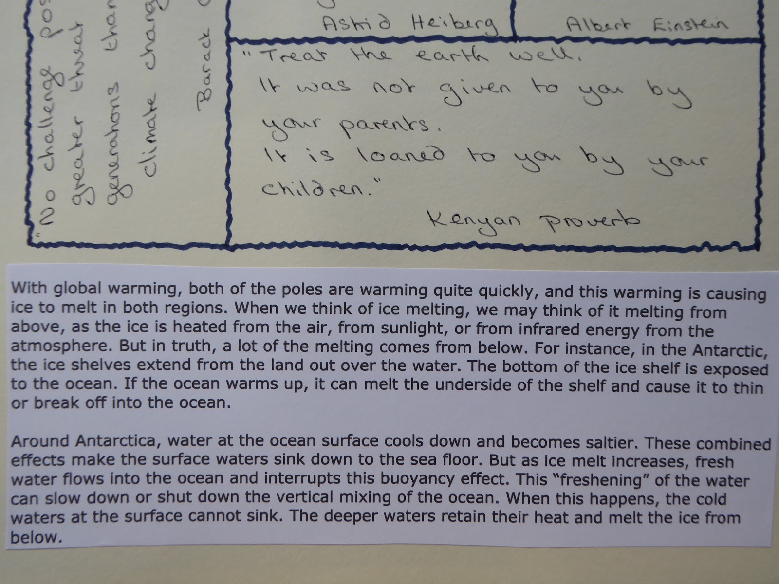
Fig: 8:2
These two paragraphs in Fig. 8.2 explain exactly what is happening to our planet.

Fig: 8:3

Fig: 8:4
Figs. 8.3, 8.4 and 8.5 show pages of research from my workbook. The focus highlighted in recent news stories is to limit global warming to 1.5 degrees Celsius rather than the 2degrees previously thought acceptable. I was interested to learn what difference this 0.5 degree would make.10 million fewer people would lose their homes to rising seas
2 million sq km of permafrost will be saved over centuries
50% reduction in global population experiencing water scarcity
1 per century limit on sea-ice-free summers in the Arctic and
50% reduction in species losing half their geographic range

Fig: 8:5

Fig: 8:6
This is a news photograph taken during the most recent fire on Marsden moor, just a few miles away from my home town.
Fig: 8:7
And Fig. 8.7 shows the flooding in Hebden Bridge which occurs with depressing regularity.Our next task was to think of words which relate to our theme and then to interpret them using only black and white paper.
My list was as follows: beauty of the sea; melting; cracking; powerful; turbulent; threatening; overwhelming; hunger; terror; stressed; vulnerable; violent; panic as flames spread or ice melts; worry about the future; shattered; confusion.
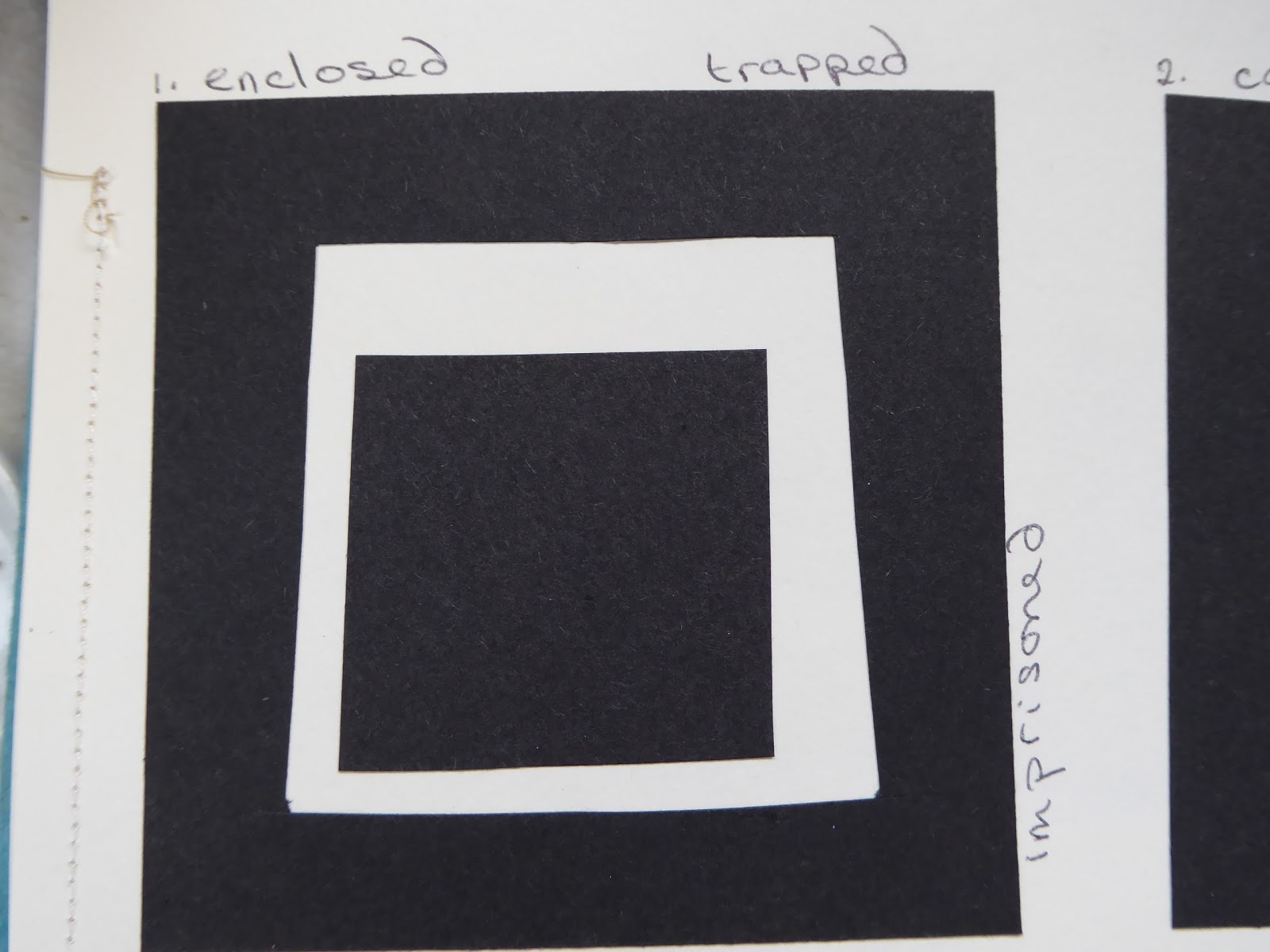
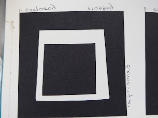
Fig: 8:8
Enclosed; trapped; imprisoned
Fig: 8:9
confined; crushed; enclosed

Fig: 8:10
Crushed; compressed

Fig: 8:11
Cracked; fractured

Fig: 8:12
Entwined; mingling; rhythmical; gentle

Fig: 8:13
Frenzied; vigorous

Fig: 8:14
Crushed; compressed; pressure; stressed

Fig: 8:15
Melting; peaceful

Fig: 8:16
Crushed; expelled; violent; vulnerable

Fig: 8:17
Fractured; cracked; shattered; violent

Fig: 8:18
Gentle; calm; peaceful; quiet

Fig: 8:19
Confused; frenzied; cracking; violent
I then chose seven of these black and white images to enlarge slightly using coloured papers. I have used papers previously coloured for this and a previous module but they are mainly in my chosen colour palette of blues, white and oranges.
Fig: 8:20
I like this sample very much and feel it could easily be developed into a final design to represent the cracking ice, turbulent seas/flood water and also the flames of the wildfires. It is definitely one that I will take forward into the next chapter

Fig: 8:21
This could represent the shifting ice floes as the ice melts and cracks, pushing sections out into the open seas.
Fig: 8:22
A more gentle design which could represent the ripples on the water or even fish swimming beneath the ice.

Fig: 8:23
More frenzied, cracking and disintegrating icebergs against a background of flames or simply the hot colours representing global warming in general.
Fig: 8:24
The 'orange' painted paper in this sample lends a smoky effect to the design which originally represented the feeling of being trapped so perhaps this is appropriate!
Fig:8:25
A development on representing conflict and confusion from Sian's examples in the module notes which seems appropriate to my theme, thinking of the wildlife caught in the fires and also on the disappearing ice masses in the Arctic and Antarctic.

Fig: 8:26
And finally a sample reflecting compression, thinking perhaps of how the ice caps melt from below and fall in on themselves.
Subscribe to:
Posts (Atom)