Sunday 16 December 2018

Chapter 6: Cutwork

We have done cutwork earlier in the course and I really enjoyed the effects that that produced but now we are to incorporate that technique with machine embroidery in order to mimic some of the designs from Chapter 2. So far I have made just four samples but may do more ...

Fig. 6:1
 Sample 1 uses a snow-dyed cotton fabric backed with felt, as the piece of cotton fabric was far too small to fit into a hoop. This first layer was stitched with simple rows of straight stitching. The top layer is a hand-dyed scrim stitched in a circular design. I had intended to do further samples from the other designs in this series but I really couldn't work out how to add the third layer as the designs seemed too complex. With more experience, I may return to this at a future date.

Fig. 6:2
 Sample 2 uses a painted bondaweb fabric attached again to a felt backing. This was stitched with wavy lines in dark blue and light blue thread. A double layer of white organza was stitched with circles in a pale blue thread and cut away to reveal the layer beneath.
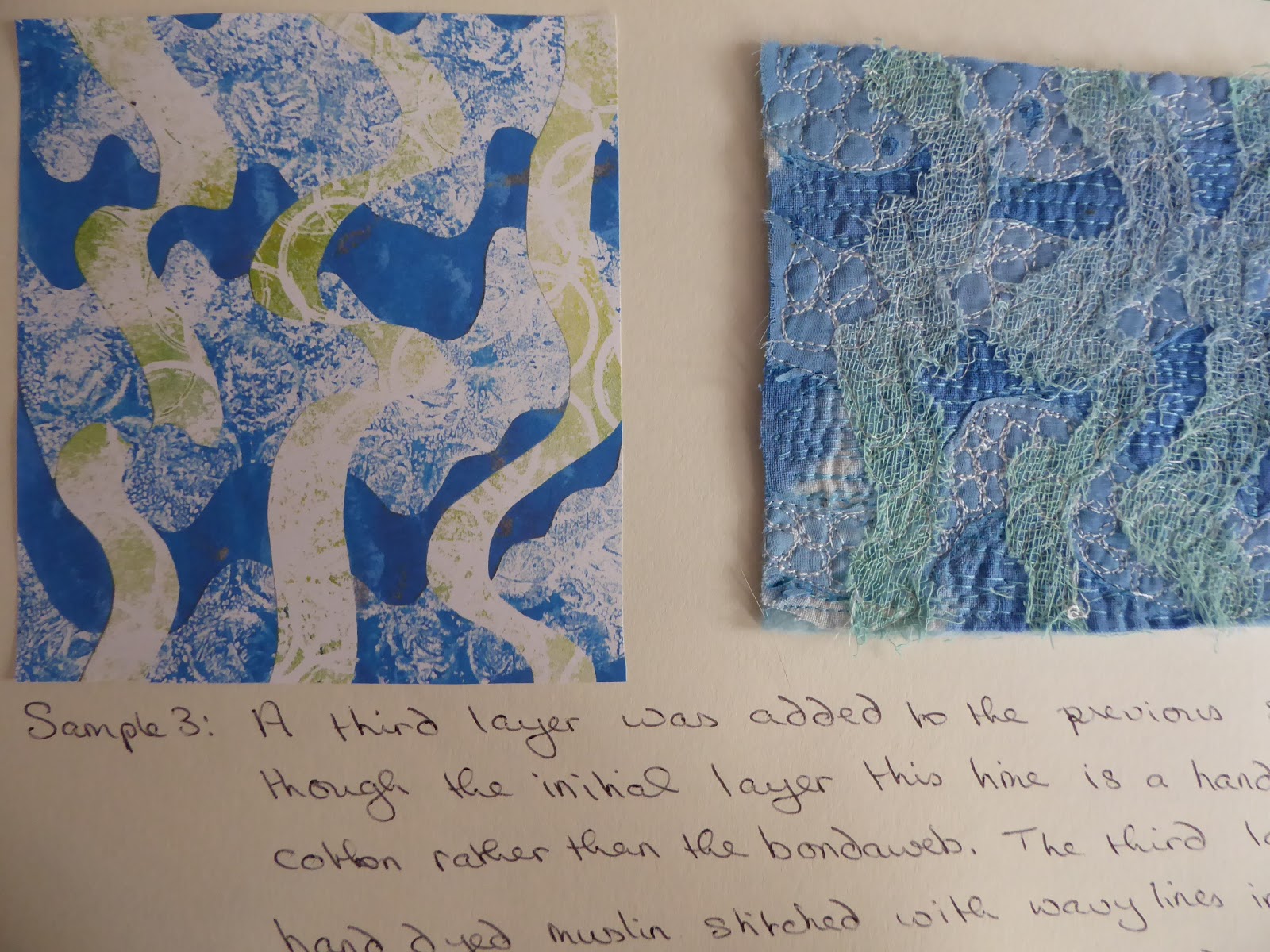
Fig. 6:3
Sample 3 shows that this time I did manage to add a third layer to the previous example. This time the initial layer is a hand-dyed cotton fabric rather than the bondaweb. The third layer is hand dyed scrim stitched with wavy lines in white thread. The stitching on this third layer doesn't really show up very well and with hindsight a cable stitched line with thicker thread in the spool would have improved the effect.

Fig. 6:4
Sample 4 shows a further development of this same design. The first layer is again stitched on a painted bondaweb fabric. The second layer - the organza - was burned away with a soldering iron. The third layer was cable stitched this time, with a fine coton-a-broder in the spool. The final layer is a dark blue jersey fabric which has been whip stitched with a zig-zag. Although I'm pleased with the way this mimics the marks on the original dark blue paper, I had hoped that this fabric might have frayed rather more than it did.

Again, I'm pleased with the effects I've achieved using this technique and feel that they mimic the original paper designs quite accurately.

Chapter 5: Interpreting drawings

For this chapter we were asked to interpret some of our papers from earlier in the module in free machine stitch.

Fig. 5:1
White thread using a zig-zag stitch on a painted bondaweb fabric

Fig. 5:2
Sample 2 shows a whip-stitch spiralling vermicelli pattern in anvy thread with a bright yellow viscose thread on the spool on a snow-dyed cotton fabric.

Fig. 5:3
Sample 3 is whip stitch crosses in a dark turquoise thread with the yellow viscose thread still on the spool. It was worked on a snow-dyed cotton fabricand some of the joining threads were left in place.

Fig. 5:4
Sample 4 is a whipped zig-zag stitch in a random pattern using white thread on a cotton fabric background which has painted bondaweb attached to it.

Fig. 5:5a

Fig. 5:5b
 Sample 5 shoes whip stitch circles in a navy sewing cotton and a yellow viscose thread stitched on top with white sewing cotton on the spool. 
I've employed a little poetic licence with samples 5, 6 and 8 as the paper in the original drawings was white but I have used the snow-dyed fabric as a background to give more colour and visual texture.

Fig. 5:6
Sample 6 is 'satin stitch' spots worked with a zig-zag stitch in navy cotton thread.

Fig. 5:7
 Sample 7 shows straight stitch worked in pale turquoise thread with patches of cable stitch using one of my hand-dyed perle threads.

Fig. 5:8
Sample 8 shows spirals worked in a dark turquoise machine embroidery thread and a bright yellow viscose.

Fig. 5:9
Sample 9 is circles stitched on hand-dyed scrim. Some threads of the fabric were cut to produce holes, while others were just pulled apart. I love this lacy effect!

Fig. 5:10 
Sample 10 shows cable stitch lines in a white perle cotton. The loops of the top thread that happened along the way actually serve to mimic the blurred sections of the original monoprint.

Fig. 5:11
This final sample shows circles stitched in a deep turquoise and a yellow thread. I was hoping to achieve the same visual mix which appears green in the original, and in some places, where the threads are very close together, I think this almost works. The reverse of this piece (see Fig. 5:12 below) has produced a lovely whip stitch as I forgot to change my tension before starting to stitch, which does mimic the blurred lines made with the oil pastels on the original rubbing.

Fig. 5:12


Overall I'm really pleased with how effectively the machine stitch echoes the original marks made on paper, and, against all my expectations, I've really enjoyed this chapter and am definitely beginning to feel more in control of my sewing machine!!

Chapter 4: Colour

Fig. 4:1
We were asked to find/colour fabrics and threads to match our twin themes of sea and sky, which related to the images we had chosen at the beginning of this module. Whilst looking around B & Q at paint colours for my brother's house, I came across a whole host of sea related colours in the paint samples. Of no practical use to the module of course, but an interesting and useful palette to have in mind.

I began by looking through my stash of fabrics for any which might be suitable and came up with this selection:

Fig. 4:2

Fig. 4:3

The fabrics in 4:2 are ones dyed by me for previous modules of this course, which are in the correct colour palette. Those in Fig. 4:3 are commercially printed fabrics, which may be of use at a later stage.

To colour my fabrics and threads this time I used just three colours of Procion dye - turquoise, ultramarine and lemon yellow.

Fig. 4:4

Fig. 4:5

Fig. 4:6

I used two types of thread - a bright white cotton perle and an undyed soft cotton thread, both of which I wound into 10 metre hanks (Fig. 4:4). I used a low immersion dye technique for both fabric and threads. The fabric (cotton, organdie and scrim) was scrunched up into the cocoa jars while the threads were draped between jamjars, each containing a different colour of dye (Fig. 4:5). The resulting threads are shown in Fig. 4:6.

Fig. 4:7

Fig. 4:8

The fabrics in Figs 4:7 and 4:8 were snow-dyed earlier in the year, using the same three colours, taking advantage of the 'Beast from the East' which provided us with lovely, powdery snow, which proved perfect for this very simple method of producing random dyed fabric.

Fig. 4:9 Organza

Fig. 4:10 Scrim

Fig. 4:11 Organza scarf

The fabric in 4:11 did not take up the dye very well and I realize with hindsight that this is probably due to its nylon content.

Fig. 4:12

Fig. 4:13

Fig. 4:14


Fig. 4:15

Fig. 4:16

I also painted some bondaweb and attached this to several pieces of white cotton fabric, which has produced some lovely sea-like effects (4:12 - 4:16).

Fig. 4:17

To complete the collection, Fig. 4:17 shows a selection of threads, some of those which I hand-dyed, others which are commercially produced.


Monday 17 September 2018

Chapter 3: Free motion

I found a couple of quotations to encourage me to begin this chapter as it was now time to make a start on the dreaded machine embroidery. In the introduction to her book 'Machine Embroidery Stitch Techniques', Valerie Campbell-Harding states that machine embroidery is "fun, relaxing and exhilarating". As I began work on these samples I did not find it to be any of these things but I do hope to change my mind over the coming weeks!

The second quote is from Nigel Hurlstone who in 2010 referred to "the potential of machine embroidery to create a new and different language that does not duplicate the original source, but breathes into it a different life that celebrates the haptic qualities of stitch and the unpredictability of cloth and thread as a way to leave an imprint of thought, time, process and the hand of the maker on and within a surface."

And so I began ...


Fig. 3:1
 Sample 1 is straight stitch with normal tension on both top and bottom. We were asked to think of words such as flowing, jerky, calm or twisty as we stitched. To be honest I found it hard enough to control my stitching into definite patterns without thinking of words as well but actually, with hindsight, the patterns do reflect these words.

Fig. 3:2
Sample 2 is of zigzag stitch with a mix of normal even tension top and bottom and tight top tension with loose bottom tension. These latter samples were far less successful and I really dislike their appearance. I shall persevere however!

Fig. 3:3
Sample 3 is part straight stitch, part zigzag with the top tension as tight as it will go (setting 9). My machine will not easily allow me to lower the tension on the spool thread but I think these samples are a reasonable approximation of the whip stitch samples shown in the course notes and I'm happy with the effect of the contrasting spole thread showing through. I'm also beginning to feel a little more in control of the stitching.
 
Fig. 3:4
And finally Sample 4 is cable stitch with a normal top tension and the hand wound spool thick threads completely bypassing the spool chase. The matt white thread in the top left hand samples is a fine coton-a-broder. The other white threads are a shiny rayon twist. The turquoise block is a 4-ply acrylic knitting yarn and proved to be a complete revelation when I turned my work over as I certainly was not expecting this effect from purely rows of straight stitch! The lime green samples are using a fine rayon tubular yarn and the pale green is a thicker coton-a-broder.

I admit that I was really not expecting to like the cable stitch samples but the tubular yarn and the 4-ply acrylic have produced some very interesting effects. A lot of thread doesn't go very far though so maybe they are really only useful for quite small areas as I certainly don't have unlimited quantities of either of these threads.

Chapter 2: Shape and layers

We were asked to choose some of our photographs from our initial research and to identify simple shapes within them, which form a pattern (however indefinite that might be). We were then to make shapes from decorated papers to echo the patterns identified in the photograph and attach them to a background, then to repeat the process.

Fig.2:1

Fig. 2:2
My first photograph is of the sky over Rannoch in Scotland - a favourite holiday destination of mine.

Fig. 2:3
My first design (sample a) cut from an ink patterned paper attached to a gelli plate print.

Fig. 2:4
Sample (a) was then cut into similar shapes and attached to a background of oil pastel and ink.

Fig. 2:5
For 2:5 I made two photocopies of sample (a), cut them into the same shapes as before and placed them together at 90 degrees to each other.

Fig. 2:6
2:6 is a photocopy of Fig. 2:4 turned through 180 degrees, cut into strips and glued to a copy of 2:5.

Fig. 2:7
I made so many versions of this pattern that I made a little book to attach to my page of samples.

Fig. 2:8
I photocopied 2:7 several times, reduced them in size and joined four of them together in different orientations.

Fig. 2:9

Fig. 2:10

Fig. 2:11

Fig. 2:12
The second photograph I chose was taken on the ferry crossing to the Isle of Bute.

Fig. 2:13
This design made from an acrylic painted bubble wrap print attached to an oil pastel and ink background echoes the ripples formed by the wash from the ferry.

Fig. 2:14
For 2:14 I photocopied the design in 2:13, cut it into strips and attached these to the page out of position to form disjointed ripples.

Fig. 2:15
2:15 is an enlarged photocopy of 2:13, cut across in the same pattern and applied to a gelli plate printed background in green acrylic paint, which acts as an effective contrast and reminds me of the greenish hue seen on the water on the actual day.

Fig. 2:16
2:16 is a print of 2:15 cut again and attached to a much darker background (inks over a wax candle rubbing), which references the darkness of the water in the photograph.

Fig. 2:17
2:17 is a print of 2:16 cut yet again and attached to the same green backing as above to reflect the turbulence and again the green tint in the wash from the ferry.
I particularly like these designs, especially the ones with the dark blue and green contrasting pieces as to me they portray the turbulence and the depth of the sea water, even on a beautiful calm day.

Fig. 2:18
My third photograph is of the sunset on the Isle of Skye. You can tell that I've holidayed in Scotland a couple of times this year!

Fig. 2:19
The background for this design is a discarded abstract painting I did quite a while ago which I chose for this exercise as it echoes the pinks and yellows in the sunset sky while the pastel coloured strips echo the blue remains of a beautifully hot day.

Fig. 2:20
Fig 2:20 shows strips of 2:19 cut vertically and attached to acrylic sponged acetate, which in reality gives a lovely translucency to the design, though I accept that this doesn't really show up in this photograph.

Fig. 2:21
Fig. 2:21 is torn strips of 2:19 alternated with strips of 2:13 then attached to a pastel coloured background and turned through 90 degrees.

Fig. 2:22
This shows torn strips of 2:19 rearranged and attached to the same background as 2:21.

Fig. 2:23
And finally, 2:22 was cut again and attached to a dark blue sgraffito background.

I have thoroughly enjoyed this chapter and had great fun playing with the designs and layers!