Fig. 10:1: Iceberg calving
I see this being stitched using a reverse applique technique with each layer being covered with machine embroidery. I have kept the design to three layers as I think that more than that could be difficult to manage and confusing to the viewer. I believe it would make an attractive large scale wall hanging which would be quite easy to display due to its robust construction. I also think that the design, although abstract, does successfully convey the message of global warming.

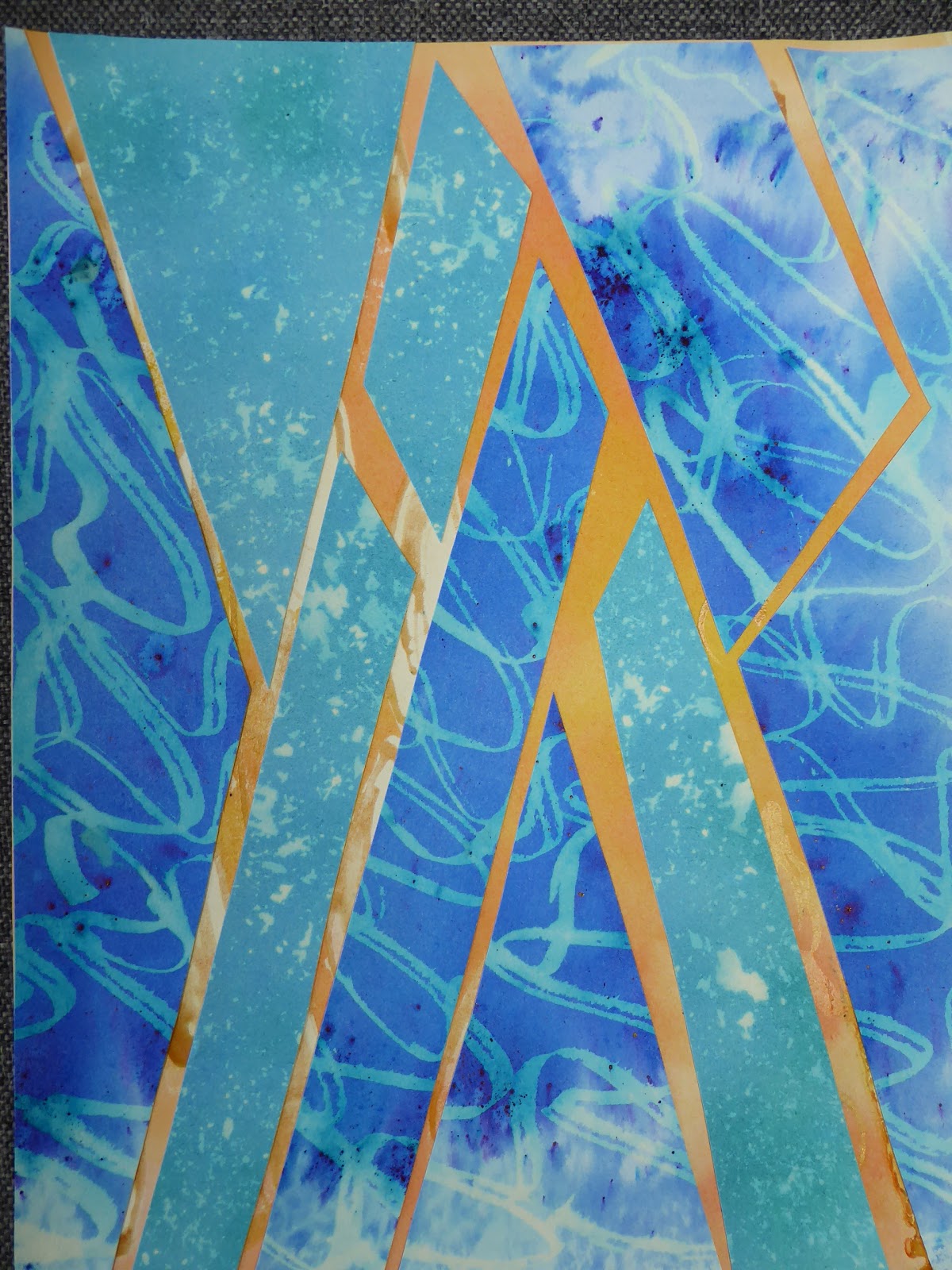
Fig. 10.2: Shattered
I liked this design in the smaller version but like it less at this larger scale. Maybe that is due to the larger number of papers used, which have made it more confusing I think. I imagined this being constructed from lacy fabrics made on soluble fabric with no backing. The four side panels would hold it in place while the centre triangles, although joined to each other and to the edging strips, would be free to move more fluidly. This would emphasise the fragility of the polar ice caps, with the red/orange pieces representing the global warming. To my mind, this is the weakest of the three designs chosen.

Fig. 10.3: Twin threats
Again, I see this being made mainly of strips of lacy fabric, either stitched on soluble fabric or onto translucent chiffon or scrim. I was a little loathe to use the 'log cabin' construction suggested in the course notes but do feel it offers the best method of making this design into a wall hanging. The strips would be held together with insertion stitches which would leave them free to move like the flames represented by the red/orange fabrics, and indeed also the movement of the flood waters represented by the blues.
I made the central block black to represent the fear, despair and ultimately death of the wildlife trapped on the moor.


