Sunday 30 August 2015

Module 1: Odds and ends

Fig.1: Composite sheet

I made a composite sheet as requested in Chapter 11 - sorry it wasn't attached to the relevant blog post but I needed to finalise Chapter 12 in order to complete it. This shows two photographs used as inspiration - the Moroccan tiles from the British Museum and the painted tiles from the town centre showing growth and disintegration. I added a paper design, some stitched stars showing threads used throughout the module, a small selection of fabrics used, including three of the silks used in the final piece. The stitched samples are a padded star covered in seeding stitches, a small star with french knot embellished slips, a star covered with random needlelace stitches and one covered in cutwork holes.

Time and expenditure
The vast majority of the materials used throughout this module have been taken from my existing stocks but the list below identifies specific items purchased.
Chapter 1: Sketchbook £4.50              9.5 hours
Chapter 2:                                            8 hours
Chapter 3:                                            14 hours
Chapter 4: Paper £3.00                        12.5 hours
Chapter 5: Fabric £8.00                       3 hours
Chapter 6:                                            8 hours
Chapter 7: Thread £3.00                      20 hours
Chapter 8:                                            16 hours
Chapter 9:                                            10 hours
Chapter 10:                                          6 hours
Chapter 11:                                          20 hours
Chapter 12: Silk fabric £8.00              22 hours
Chapter 13:                                          3 hours
Total:          £26.50                              152 hours

Health and safety:
  • Take normal levels of care whilst using electrical equipment i.e. don't leave electrical cables trailing across the floor or work space.
  • Cover all surfaces with plastic sheeting as well as newspaper when using Brusho inks and other paints to protect your work surface.
  • Use a cutting mat and non-slip ruler when using a craft knife to cut papers. Replace the blade regularly to ensure a clean cut and always replace the cap when not in use.
  • Work in a well-ventilated space with water close at hand when using candles or matches.
  • Work on a heat resistant surface when using heat tools.
  • Use the correct heat for the fabric when using an iron, and keep fingers out of the way - especially when using steam.
  • When bonding fabrics ensure that baking parchment is used beneath and on top of the fabrics being bonded to prevent damage to your iron.
  • Take care when using sharp pointed scissors to slash fabric to ensure they don't also slash your fingers.
  • Use a darning foot and embroidery hoop when doing free machine embroidery to protect your fingers.
  • Always, always keep pins, needles and other sharp items away from pets (and young children if you have them). Cats are curious, playful and very precious!
Storage: 
As I live alone practically my entire house has evolved into my 'studio' so fabric and machine thread is stored together with my sewing machine in one bedroom. Art materials and electrical equipment are stored on fitted shelves around my workbench in the garage, which also has a sink and houses the ironing board (I don't own a car). My hand embroidery threads, embroidery fabric, beads etc for hand stitching are stored on shelves in my study (which also houses my computer and printer).
  • Threads are sorted by type and colour, wound on cards and stored in labelled, transparent plastic boxes. 
  • Fabric is sorted by type and stored in labelled transparent plastic boxes.
  • Electrical equipment is also stored in a plastic box to ensure it is kept dry and away from harm or prying paws.
  • Papers are stored flat in a box.
  • Art materials are stored in labelled drawers and plastic boxes by type e.g. pens; pencils; paints; inks; fabric paints; stamps; stencils; punches etc.
  • I made a double pinboard from fabric covered foamboard with fabric hinges and a tie so work in progress and inspirational pieces can be stored safely between work sessions.

Chapter 13 - Take three artists

Fig.1: Herta Puls
Herta Puls
Herta Puls was born in Germany in 1915, moving to England in 1939. Here she studied embroidery and textile design at the Newport College of Art, the West of England College of Art in Bristol and the London College of Fashion. She was a member of the 62 Group of Textile Artists, the Practical Study Group and the Quilters Guild and Textile Society.

Fascinated by the embroidery of Panama whilst visiting the San Blas Islands in that area, she has written two books - the Art of Cut Work and Applique and Textiles of the Kuna Indians of Panama. The needlework of the Kuna tribes was based on traditional body painting, with stitched versions appearing in the late 19th century. The word 'mola' means cloth, clothing, or blouse and these reverse applique panels usually form the front and back panels of a woman's clothing.

Traditional designs are generally geometric, abstract or based on nature - fish, birds and the sun, all of which have spiritual significance to the indigenous people. The quality of a mola is determined by the number of layers, usually up to five, and the fineness of the stitching, with the very best examples having stitches which are practically invisible.

Herta's inspiration for her own versions comes from nature and from sketches made on her travels to Panama, India, Thailand and Indonesia as well as to the Americas. This kind of work features in this module in the chapters on reverse applique and, having now attempted this for myself, I am in total awe of the skills of Herta and the Panamian ladies who make the most amazingly intricate designs.

Ref: https://en.wikipedia.org/wiki/Mola_(art_form)

Fig 2: Wassily Kandinsky
"Colour is a power which directly influences the soul"
Wassily Kandinsky
Kandinsky was born in 1866 in Moscow where he initially studied law and economics before moving to Munich where he studied art, going on to teach at the Bauhaus School of Art and Architecture for a period of some eleven years. Shortly before the outbreak of the second world war he moved to France where he lived for the remainder of his life.

From very early in his artistic career he saw parallels between music and painting, often using musical terms to describe his art. He said that colour was the keyboard, the eyes the harmonies and the soul was the piano with many strings. He saw the artist as the hand that plays, touching one key then another to cause vibrations in the soul. He claimed that when he saw colour he heard music with tone of colour being the timbre, hue as pitch and colour saturation as volume.

His fascination with colour symbolism was a constant in his life and his art, his paintings containing swathes of bright colours and, initially at least, recognisable forms of buildings and seascapes. By the early 20th century, however, his paintings had become increasingly abstract with shapes being over-laid to create depth.

Many of his abstract works from the 1920s incorporate crosses, as in the image at bottom right of Fig. 2 above, entitled simply 'White' and in this way his work relates to the themes of this module, as does his use of colour. I also feel that many of his paintings would easily lend themselves to interpretation in applique and stitch.

Ref: https://en.wikipedia.org/wiki/Wassily_Kandinsky

 Fig. 3: Chuck Close
Fig. 4: Chuck Close continued

Chuck Close
Chuck Close was born in America in 1940 and, due to severe dyslexia, which severely affected his academic life, he turned to art, encouraged by his artistic parents. Close credits his prosopagnosia (face blindness) for his decision to paint portraits, thus enabling him to better remember faces.
Using a process which he described as 'knitting', he took large format Polaroid photographs of his models which he then recreated on canvas. His huge portraits are formed by placing a grid on the photograph and on the canvas, and then copying cell by cell. Each square on the grid is filled with rough circles of colour which, when viewed from a distance give a rough approximation of the colour on the original.

Having been to an exhibition of his work in London a couple of years ago I was totally 'blown away' by the intricacy of his methodology and by the fact that such a fragmented image when viewed close up can produce such realism when viewed from a distance. His art is even more impressive when you realise that in 1988 Close suffered a massive seizure which left him paralysed from the neck down. Physiotherapy has returned some movement to his arms and legs though he is still largely confined to a wheelchair and produces his huge pixelated portraits by pivoting the canvas and with a device strapped to his wrist and forearm to hold his brush (see photograph at bottom of Fig.3 of the artist at work).

He also makes wall-size tapestry portraits where the image is made up of endless combinations of woven threads in a myriad of colours. His work is relevant to the module due to its fragmented nature, which can be argued to represent the disintegration of the whole portrait into individual pixels, and also his use of vivid colours, which when viewed from a distance actually look very realistic.

Refs: https://en.wikipedia.org/wiki/Church_Close
www.pacegallery.com/artists/80/chuck-close


Chapter 12: Final resolve complete

Wow! I can't quite believe it but I do think that I'm finished with this starry module.
Following on from my initial thoughts detailed in my last blog post I thought of several methods for depicting growth and disintegration in my final resolved sample.

Growth:
  • Padding the shape would make the piece more prominent
  • Textural stitches could represent lichen growth  
Disintegration:
  • Hand or machine stitching beyond the outlines of the shape
  • Synthetic fabric melted with a soldering iron or heat gun 
  • Voile on top of the shape to 'knock back' the colours to represent fading
  • Machine stitch through paper to leave fragments on the surface and holes
  • Use open weave fabrics or silk dupion which fray easily
  • Chenille technique
  • Cutwork 

Fig. 1: Decisions, decisions

I did toy with using my dancing stars or even starfish but finally decided to go with the eight pointed star which is so reminiscent of the Moroccan tiles which have featured in my thinking throughout this module. I opted for simply placing four of the stars within an 8" square and also to make a feature of the negative cross shapes in between the stars, as evidenced in the tile images way back in the early part of my research.

At this point I found I had so many ideas running around in my head that I was struggling to decide on anything and days were passing without any action whatsoever. Then ... whilst waiting for a bus one day in town I spotted the tiles shown in the bottom right hand corner of Fig. 1. These had been painted several times over the years and layers of paint were now peeling and lichen had begun to grow. Their colour also shouted at me as some of the layers were blue and orange! A serendipitous find which brought my scattered thoughts together.

Fig. 2: Design 'on point'
I decided to put the design 'on point' with the top star remaining intact; the left hand star growing with lichen, the one on the right disintegrating with cutwork and the bottom star would have both growth (french knot slips) and disintegration (cutwork).

I layered calico as a backing fabric, a layer of thin cotton batting and a coral coloured silk dupion as my background fabric and drew out my design on the back of the calico then tacked around the lines through all three layers of fabric. My stars were made from three layers of silk fabric bonded together and backed with a soft iron-on interfacing to give a slightly raised appearance to my 'tiles' when they were appliqued in place. 

I sprayed lightweight calico with Brusho shimmer sprays in turquoise and burnt sienna to replicate the lichen and rust, which I used to make small slips embroidered with french knots to represent the lichen. The slips were appliqued in place, with the turned under edges giving them a little more body so they stand proud of the background tile. More french knots were stitched around and between the slips to give a more integrated effect.

The cutwork holes were cut through all three 'tile' fabrics so the coral background fabric shows through and buttonholed around to define the edges. I finished the piece by stitching an outline around each of the tiles and the negative spaces on the edges to define the cross shapes and to give a very lightly quilted effect to the whole piece.

Fig. 3: Final resolved sample.

Evaluation:
On the whole I am very pleased with the finished effect and believe that the techniques that I used were suitable for the purpose, adequately represent both growth and disintegration, and have resulted in an attractive piece of work. If I were to repeat the design I might make the design on the tiles more intricate and stitch the layers together in some way rather than merely bond them. I am happy that I stayed with my enthusiasm for the Moroccan tile designs though I may return to the theme at some point in the future and make something with my dancing stars or my starfish - a border design with starfish 'holding hands' maybe?

Saturday 1 August 2015

Chapter 11 - Final resolve

My initial thoughts on this piece -
  • Size should be 8" square
  • Theme: Growth and disintegration
  • Growth - deeper/brighter colours or larger shapes
  • Disintegration/decay - fading colours, worn shapes, smaller shapes, colours merging into the background - mould or lichen on a surface; worn tiles; flaking paint; rotting wood
  • I would like the piece to be something that I can live with afterwards!
  • The Islamic tiles which have featured in my thoughts and samples throughout this module - the repeating patterns lend themselves to this brief
  • Fabrics: silk and muslin are both easily frayed and easily dyed to show the fading colours
A. Paper samples: Squares of paper distressed in a variety of ways to show disintegration

Sample 1 in the picture above has been perforated with a hole punch
Sample 2 was crumpled and twisted until the paper had gone soft, then rubbed until holes began to appear
Sample 3 - the edges were torn
Sample 4 was soaked in water then crumpled and rubbed
Sample 5 was slashed with a scalpel then crumpled and rubbed

Sample 6 was burned with a joss stick (lavender scented so this page smells very pleasant :-))
Sample 7 was pierced with a fine knitting needle
Sample 8 was machine stitched then wet and rubbed until holes appeared

In my opinion the burned and machine stitched samples (Nos 6 and 8) are the most successful.

B. Paper experiments
These four samples show an increasingly disintegrated shape where a little more paper has been torn away each time. This works well though Sample 4 looks more like a flower to me than a star.

C. Paper shapes
Samples 1 to 4 show a negative star shape with fragments of the star which has been removed being replaced. Sample 3 is, to my mind, the most effective. And Sample 5 is the star cut from Sample 4 with its holes punched in it.

D. Fabric shapes - muslin squares were cut in various different ways and frayed to varying degrees


 E. Stitched shapes
Samples a, b and c in the above image use increasing numbers of rows of running stitch to make the star appear to be disintegrating.
Sample d - needle-weaving was used to break the shape of the star up. I feel that this is more effective than the running stitch as some areas are more solidly covered.
Samples e, f and g - I took photographs of the process of stitching french knots, increasing the density on two of the star points only. Sample g looks as though it is encrusted with lichen I think.
Sample h uses cutwork - a series of small holes edged with buttonhole stitch - this works really well.
Sample i has needlelace worked on some of my painted papers. This, also works.
Sample j consists of a star cut from coloured paper with a piece of machine embroidered tissue paper fixed behind. The machine has pulled holes in the tissue and this also works really well.

All in all - some really useful techniques here and lots of ideas buzzing around in my head with regard to how to show my stars disintegrating.

F. Design ideas
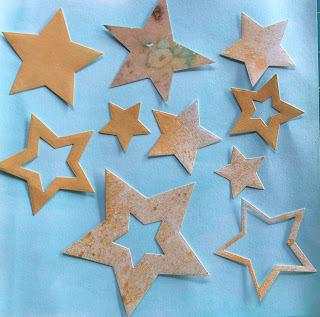
I have a Sizzix machine and a nesting set of five pointed star cutters so cut out a large number of stars in different sizes and thicknesses, together with a piece of lightly painted paper cut to the finished size of 8" square, then played around with various arrangements.


I feel that the less solid and the smaller stars do look as though they're either fading into the distance or disintegrating.


I then chose a couple of the arrangements and distorted them in an app on my ipad - this has made the edges blur and look as though the stars are being worn away though I'm not entirely sure at the moment how I would replicate this in stitch.

And finally a more formal design taken from my Islamic tiles where the negative spaces between the eight pointed stars forms a cross shape.

Which to choose?? - Ideas on a postcard please!!


Chapter 10 - Chenille

I have to say, up front, I love, love, love this technique!!
I started by drawing my slightly asymmetric five pointed star with lines going in various directions and then decided to do a sample with stars stitched within stars. There are five layers of silk, organza and scrim on a backing of muslin in this first sample. I think, however, that because of the small sample size I stitched my lines too close together so the fabrics didn't get a proper chance to fray.


So I stitched a bigger sample, again with five layers of silk and cotton on a calico backing this time to give the sample a bit more body. I stitched parallel lines through my initial star shape this time but only slashed the fabric inside the star and this time the lines were further apart. Putting this sample on the scanner to take the photograph may have flattened the pile a little but I'm very pleased with this piece and may well use this technique in my final resolved piece as I do think it represents disintegration/decay quite well.