Monday, 17 September 2018

Chapter 2: Shape and layers

We were asked to choose some of our photographs from our initial research and to identify simple shapes within them, which form a pattern (however indefinite that might be). We were then to make shapes from decorated papers to echo the patterns identified in the photograph and attach them to a background, then to repeat the process.

Fig.2:1

Fig. 2:2
My first photograph is of the sky over Rannoch in Scotland - a favourite holiday destination of mine.

Fig. 2:3
My first design (sample a) cut from an ink patterned paper attached to a gelli plate print.
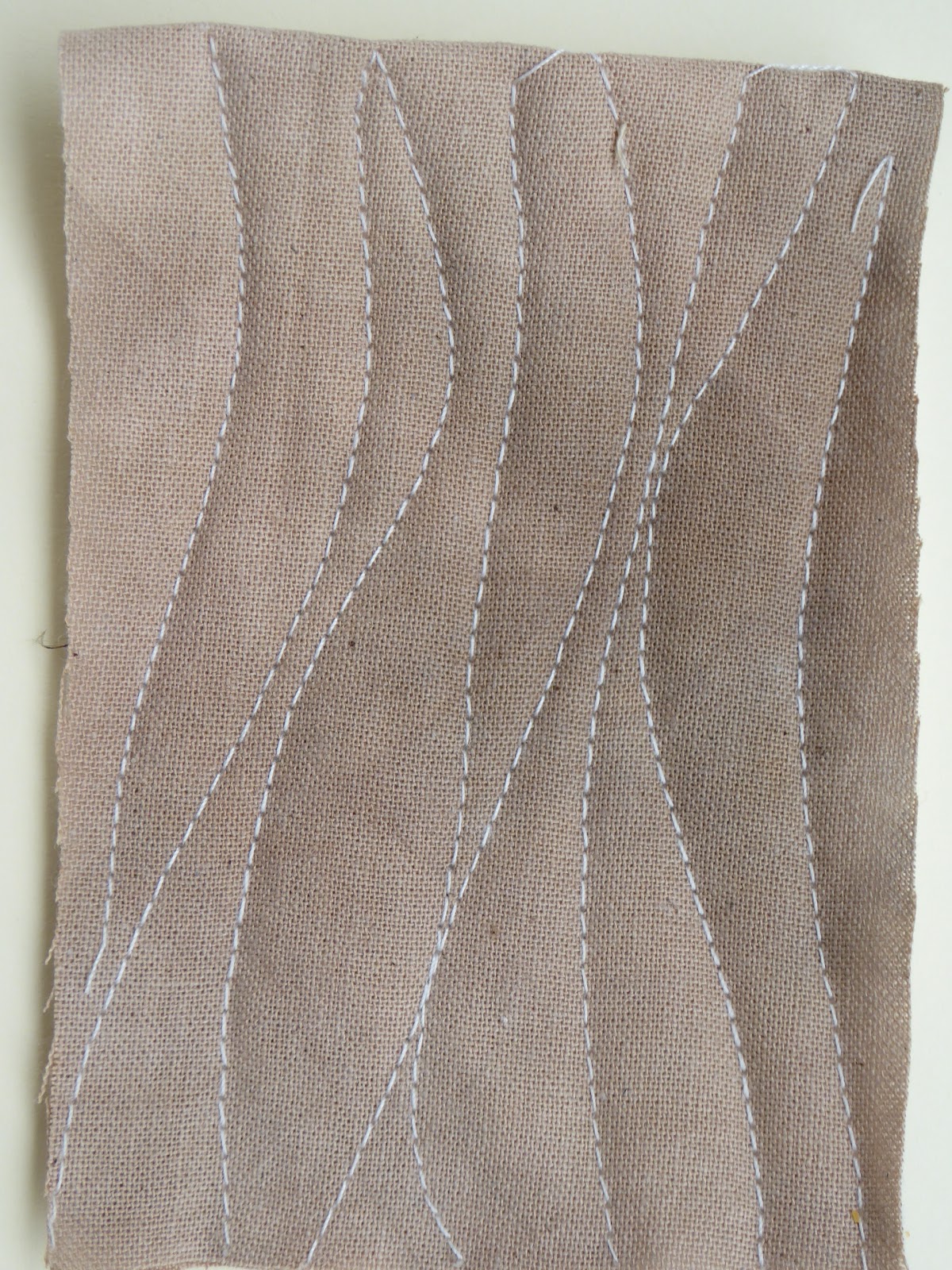
Fig. 2:4
Sample (a) was then cut into similar shapes and attached to a background of oil pastel and ink.

Fig. 2:5
For 2:5 I made two photocopies of sample (a), cut them into the same shapes as before and placed them together at 90 degrees to each other.

Fig. 2:6
2:6 is a photocopy of Fig. 2:4 turned through 180 degrees, cut into strips and glued to a copy of 2:5.

Fig. 2:7
I made so many versions of this pattern that I made a little book to attach to my page of samples.

Fig. 2:8
I photocopied 2:7 several times, reduced them in size and joined four of them together in different orientations.

Fig. 2:9

Fig. 2:10

Fig. 2:11

Fig. 2:12
The second photograph I chose was taken on the ferry crossing to the Isle of Bute.

Fig. 2:13
This design made from an acrylic painted bubble wrap print attached to an oil pastel and ink background echoes the ripples formed by the wash from the ferry.

Fig. 2:14
For 2:14 I photocopied the design in 2:13, cut it into strips and attached these to the page out of position to form disjointed ripples.

Fig. 2:15
2:15 is an enlarged photocopy of 2:13, cut across in the same pattern and applied to a gelli plate printed background in green acrylic paint, which acts as an effective contrast and reminds me of the greenish hue seen on the water on the actual day.

Fig. 2:16
2:16 is a print of 2:15 cut again and attached to a much darker background (inks over a wax candle rubbing), which references the darkness of the water in the photograph.

Fig. 2:17
2:17 is a print of 2:16 cut yet again and attached to the same green backing as above to reflect the turbulence and again the green tint in the wash from the ferry.
I particularly like these designs, especially the ones with the dark blue and green contrasting pieces as to me they portray the turbulence and the depth of the sea water, even on a beautiful calm day.

Fig. 2:18
My third photograph is of the sunset on the Isle of Skye. You can tell that I've holidayed in Scotland a couple of times this year!

Fig. 2:19
The background for this design is a discarded abstract painting I did quite a while ago which I chose for this exercise as it echoes the pinks and yellows in the sunset sky while the pastel coloured strips echo the blue remains of a beautifully hot day.

Fig. 2:20
Fig 2:20 shows strips of 2:19 cut vertically and attached to acrylic sponged acetate, which in reality gives a lovely translucency to the design, though I accept that this doesn't really show up in this photograph.

Fig. 2:21
Fig. 2:21 is torn strips of 2:19 alternated with strips of 2:13 then attached to a pastel coloured background and turned through 90 degrees.

Fig. 2:22
This shows torn strips of 2:19 rearranged and attached to the same background as 2:21.

Fig. 2:23
And finally, 2:22 was cut again and attached to a dark blue sgraffito background.

I have thoroughly enjoyed this chapter and had great fun playing with the designs and layers!

Friday, 14 September 2018

Module 6: Chapter 1 - Making marks

Life always seems to have a way of taking over in the summer months and never more than this year! It has all been good but has definitely kept me away from my sewing machine and my computer. Now things have quietened down briefly I've finally managed to make a start on the final module of my City and Guilds Certificate in Embroidery.

I have to admit that I've not really been looking forward to this as machine embroidery is definitely not 'my thing' and I've been dreading having to do a whole module on the machine. However, I am excited by the topic and by the proposed final piece of work and I'm hopeful that by the end of the course I shall have learned to enjoy machine embroidery at least a little!

For this first chapter we were asked to take photographs of sky and sea and, having read the module through briefly before my two holidays in Scotland this summer I was prepared and had lots of images to choose from.

Fig. 6:1

Fig. 6:2

Fig. 6:3

Fig. 6:4

Fig. 6:5

In addition to my own photographs I looked at work by Van Gogh and Turner. Van Gogh paints lots of stitch-like marks which are a gift to anyone working in textiles.
 
Fig. 6:6

Fig. 6:7

Fig. 6:8

Turner's paintings are always very atmospheric, and I was intrigued to learn that he used watercolour techniques whilst working with oil paint in order to achieve this, and again uses complementary colours, albeit in more muted tones than Van Gogh.
 
Fig. 6:9

Fig. 6:10
Finally I tried a few samples on transparent surfaces.


Friday, 15 June 2018

Three Artists and Admin


Chapter 12: Resolution

We are asked to take each textured area in our chosen design and work out how it could be translated in a textural way with fabric manipulation and hand stitching.
Fig. 12:1

As we are instructed to use extreme contrasts, I have identified four separate areas in my design, with the two circular shapes or 'knots' being identical, albeit of different sizes. I do see areas 1 and 2 in the plan on the left above as being of a similar nature, both raised and ribbed, with area 3 being flat to act as a contrast. The two circular areas (4) will then be raised higher again, possibly with the aid of beads beneath the pieces.

With all this in mind, and looking at all the multitude of previous samples made for this module, I began stitching.

Fig. 12:2
 

Fig. 12:3
 

Fig. 12:4
Figures 12:2, 12:3 and 12:4 show my ideas for sections 1 and 2  12:2 is a layer of scrim over a piece of quilt batting which has then been whip stitched to manipulate the fabric into deep folds. By altering the direction of stitch it is possible to distort the surface even more so there are raised bumps even between the ridges. This is a technique gleaned from Jean Draper's book Stitch and Structure and one I enjoyed learning though I feel that much more practice is needed to produce the impressive surfaces shown in her book. Fig. 12:3 is strips of the same hand-dyed scrim knotted and applied to a base fabric. 12:4 is a series of wrapped threads and gimp twisted and couched onto a base fabric.
I chose the two techniques in 12:2 and 12:4 for my two sections in the finished piece.

Fig. 12:5

Fig. 12:6

Fig. 12:7 

 Figs. 12:5, 12:6 and 12:7 show ideas for the flatter area No.3 in the design. 12:5 is a number of fabrics - silk, scrim, hand dyed cotton - five in total, which were stitched on the machine in wavy lines then cut through to different depths and rubbed to make the edges fray. 12:6 is layer upon layer of fly stitch using a wide variety of threads and Fig. 12:7 is two pieces of hand dyed cotton fabric sandwiched with quilt batting and quilted on the machine. As the brief stipulates hand stitch I opted to use the fly stitch technique for my final piece.

Fig. 12:8

Fig. 12:9

Fig. 12:10

Fig. 12:8, 9 and 10 are intended for the two circular areas or knots on my tree bark. 12:8 is hand dyed cotton furrowed, 12:9 is two yo-yos stitched atop each other and 12:10, my preferred option is a hand dyed ribbon gathered and couched randomly over the surface topped with a hand dyed thick rayon cord which has been looped and couched on top.
 
Fig. 12:11

In the midst of making my resolved sample the whole family went on holiday for ten days to the Isle of Skye and then to a cottage in the Black Wood of Rannoch on the edge of Loch Rannoch in the Scottish Highlands. Inspired by the glorious scenery and the information that The Black Wood is also known as the Singing Forest,  I decided to add some words between the stitched pieces. 
"The trees sing their siren songs
 as the wind whispers its secrets
 through their branches 
 in Rannoch's Black Wood."

Some detail photographs follow ...

Fig. 12:12

Fig. 12:13

Fig. 12:14

Fig. 12:15

Fig. 12:16

Fig. 12:17

Each section was stitched onto a piece of pelmet vilene cut to shape. In Section 1 (top left of the piece) I allowed the scrim to pull into holes in places to add further texture to the manipulated surface.
Section 2 is stitched onto a piece of slub silk fabric which I didn't want to cover completely so have left some areas open to view to again add further depth to this section and to emphasize the texture of the wrapped cords. I used a variety of methods for making the cords. I wrapped different numbers of core threads by hand with a variety of threads, some matt, some shiny. I wound gimp through and amongst these and then knotted and twisted and couched lengths of extra chunky knitting yarn, again twisting some areas with the gimp and wrapped cords.
Section 3 uses a wide variety of hand dyed threads fly stitched onto a piece of hand dyed cotton fabric and the two circular pieces are raised up on buttons, the large one (top left) on quite large wooden buttons and the smaller one on smaller buttons to again give a variation in height and added interest to the piece.

Evaluation
I am extremely satisfied and absolutely delighted with the results of this piece. It fulfils the design brief - the embroidered section measures between 20 and 30cm and reflects the topic of texture in landscape - in my case tree bark. I am pleased to have been able to link it to a very memorable holiday (celebrating a 'special' birthday) and will frame it and hang it on my wall as a memory piece. It is also all hand stitched, again fulfilling the brief.

If asked to make it again I think the only change I would make might be to practice the whip stitching a little more to make more of the top left hand section. I am aware that there are no frayed edges in my piece, which is something which has been emphasised during this module, but it does reflect my personal style, whilst being slightly less 'controlled' than some of my work.