Fig.2:1
Fig. 2:2
My first photograph is of the sky over Rannoch in Scotland - a favourite holiday destination of mine.
Fig. 2:3
My first design (sample a) cut from an ink patterned paper attached to a gelli plate print.
Fig. 2:4
Sample (a) was then cut into similar shapes and attached to a background of oil pastel and ink.
Fig. 2:5
For 2:5 I made two photocopies of sample (a), cut them into the same shapes as before and placed them together at 90 degrees to each other.
Fig. 2:6
2:6 is a photocopy of Fig. 2:4 turned through 180 degrees, cut into strips and glued to a copy of 2:5.
Fig. 2:7
I made so many versions of this pattern that I made a little book to attach to my page of samples.
Fig. 2:8
I photocopied 2:7 several times, reduced them in size and joined four of them together in different orientations.
Fig. 2:9
Fig. 2:10
Fig. 2:11
Fig. 2:12
The second photograph I chose was taken on the ferry crossing to the Isle of Bute.
Fig. 2:13
This design made from an acrylic painted bubble wrap print attached to an oil pastel and ink background echoes the ripples formed by the wash from the ferry.
Fig. 2:14
For 2:14 I photocopied the design in 2:13, cut it into strips and attached these to the page out of position to form disjointed ripples.
Fig. 2:15
2:15 is an enlarged photocopy of 2:13, cut across in the same pattern and applied to a gelli plate printed background in green acrylic paint, which acts as an effective contrast and reminds me of the greenish hue seen on the water on the actual day.
Fig. 2:16
Fig. 2:17
2:17 is a print of 2:16 cut yet again and attached to the same green backing as above to reflect the turbulence and again the green tint in the wash from the ferry.
I particularly like these designs, especially the ones with the dark blue and green contrasting pieces as to me they portray the turbulence and the depth of the sea water, even on a beautiful calm day.
Fig. 2:18
My third photograph is of the sunset on the Isle of Skye. You can tell that I've holidayed in Scotland a couple of times this year!
Fig. 2:19
The background for this design is a discarded abstract painting I did quite a while ago which I chose for this exercise as it echoes the pinks and yellows in the sunset sky while the pastel coloured strips echo the blue remains of a beautifully hot day.
Fig. 2:20
Fig 2:20 shows strips of 2:19 cut vertically and attached to acrylic sponged acetate, which in reality gives a lovely translucency to the design, though I accept that this doesn't really show up in this photograph.
Fig. 2:21
Fig. 2:21 is torn strips of 2:19 alternated with strips of 2:13 then attached to a pastel coloured background and turned through 90 degrees.
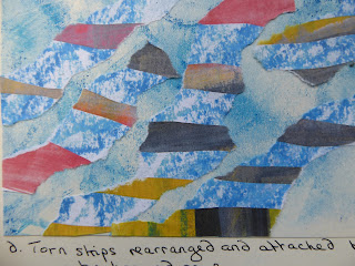
Fig. 2:22
This shows torn strips of 2:19 rearranged and attached to the same background as 2:21.
Fig. 2:23
I have thoroughly enjoyed this chapter and had great fun playing with the designs and layers!


No comments:
Post a Comment